Pages

Saturday, May 29, 2010

Today was Funky Friday!


Ooh, what fun! Fingerpaint! Last week my sweet kindergarten students fingerpainted, and today we created creatures of all sorts - dragons, aliens, cats, unicorns, and totally new inventions. After all, it was Funky Friday!
We started by cutting our fingerpainting into a body for our creature, and then we dug into piles of end-of-year scraps, where we found everything from patterned paper, corrugated cardboard, and chunks of cereal boxes. We cut and glued enthusiastically, as you can see in these photos.

We've decided to add to them a little more in our next art class, gluing where necessary, but also using crayons to create an environment for the creature. We couldn't have done this project back when school began - boy have these kindergartners grown up.

Meanwhile, it was quite a busy eventful day in the art room, because after 12 weeks, it was my student teacher's last day. The kids will miss her. Jess, if you are reading this, you did a great job! Maybe next week (with her permission) I'll post some of the beautiful pointilist perspective city and country street scenes that the 5th graders painted while she was here teaching. The kids loved stamping away with long Q-tips.
Then I stayed after school for a LONG time setting up for a sub, so that Tuesday I can go on a field trip with the 2nd graders to the Teddy Bear Factory in Vermont. We'll be taking a ferry ride across Lake Champlain in one direction and the kids are oh so excited. I guess we'll need to draw and paint some teddy bears next week.
Congrats to those of you who have completed the end of your school year - we're still in session till June 24th...

Wednesday, May 26, 2010

Warm and Cool 3-D Cities!


My 3rd graders painted these totally awesome tempera 3-D cities! I'm so proud of them!!

We started out by drawing arrows pointing straight up, using a Sharpie marker without pre-drawing. No such thing as a mistake!
Then, to create the "3-D" buildings, the ends of the arrowheads were connected straight down to the bottom of the paper, or until they bumped into another building.
Finally we added our concentric circle skies, which is an idea I adopted from another blogger.

To paint them, we first used a palette of only warm colors and white, to create various colors and tints. The kids chose whether to use them for the buildings or the sky.
In our next art class, students were given just cool colors and white, to paint the opposite of what had been previously painted in warm colors.
For our third session, we finished any warm and cool colors not completed, and then used black paint to re-outline and add windows and doors. Some kids got the hang of slanting the window tops and bottoms along with the slant of the roof line, and others found this a bit more challenging. A number of kids will have to finish in their next art class. Good job 3rd graders!
*** I have tried.. and tried... and tried... to post 3 more photos of the most spectacular paintings in this batch that I really wanted you to see, all photographed at the same time, same camera settings, same everything, but each time I insert them, they show up SIDEWAYS. They were NOT rotated on the computer, and the camera was not rotated, so I am totally befuddled. Anyone have a clue why this might be happening? HELP!!

Monday, May 24, 2010

Recyled Art - use those old CD's!


These projects in these photos were all done by 2nd graders. All these projects used old obsolete CD's that would have otherwise been discarded.

Earlier this year, my students in grade 2 learned about artist Romare Bearden. We noted the importance of music in his life, which is reflected in his colorful collages/paintings. The high school music teacher loaned us a guitar, a saxaphone, a tambourine, and more, and the students practiced drawing them while listening to some fun and funky jazz.

Then each student received an 18x24" sheet of paper with an old CD glued on it. The challenge was to incorporate the CD into a painting that reflected the feeling of the jazz music. CD's were turned into parts of musical instruments or musical notes.

The paintings were completed with rich colors of tempera, with white and black tempera details and outlines.
Here are some fun "Matisse-mobiles" made using the old CD's with wheels. We covered the openings with contact paper circles and inserted brass fasteners to make the wheels turn.
These flowers were also fun to make, using the CD as the center.
We've also used CD's in collages of robots, using the CD as the head or the body. That silvery round shape can inspire so many great ideas!

Thursday, May 20, 2010

Into the Caves! by 4th grade


These are samples of 4th grade cave paintings on "rock" (no, it is not traditional clay - read on to find out the crazy material we used). Students did their artwork after learning about the paintings in Lascaux and other caves painted over 15,000 years ago.
  • First, we brainstormed about the possible materials that would have been used, since there was no Wal-Mart 17,000 years ago to buy art supplies! And we discussed possible reasons for prehistoric man to have created these greart works of art.
  • Then, we created our own hunks of cave wall for our artwork.
  • To prepare in advance of this lesson, I gathered bags of shredded paper from the school office, and poured in some hot water to soften it up. The next day, I mixed up a couple of batches of Art Paste (shown in the yellow box below), and poured a bunch into the bags of softened recycled paper. Some kids came in at lunchtime and were thrilled to be able to help squish the "dog drool" into the gloppy paper.

  • When 4th grade art class time arrived, I handed each student a bundle of "glop", and as we discussed the story of Lascaux and brainstormed for ideas, each student continued to knead his lump, breaking down the paper so it became a textural claylike substance by the end of the class. Here's my hands demo-ing kneading the lump.


  • Then, each student "patty-caked" their lump into a slab of rock wall. Before putting it away to dry, students inserted a paper clip into the top to serve as a hanger.
  • Now for the big adventure! Students had looked at animal pictures and prepared drawings in advance of "entering the caves".
  • When they arrived for art class, they found the tables either draped with fabric or blocked off with large sheets of cardboard. Their paper clay had dried out and was rock solid and virtually unbreakable.
  • The lights were dimmed, a CD with the sounds of wolves, rain, and other natural sounds was turned on, and students took their needed materials into their caves (under the tables). They used pieces of vine charcoal to draw, and I provided various neutral colors of paint. Paint was brought into the caves by placing small dips of colors on sheets of scrap paper, which also became mixing palettes.
  • Some students preferred the solitude of their own corner of a cave, while others chose to crowd into a cave together. Some used flashlights as torches, and others occasionally emerged from the cave to check out their color choices. The kids were thrilled. You would have thought that I gave them the best present ever, and not just the opportunity to sit on the uncomfortable floor under a table!

  • After the rock was painted, the kids also had the opportunity to either stamp or stencil their hand on a sheet of brown Kraft paper, which became the backing paper on a bulletin board. The 4th graders are very proud of their "prehistoric" cave paintings.

Wednesday, May 19, 2010

Posters for our Library by grade 4 & 5


My school district's local library (the Town of Chester Library, located in Chestertown NY) asked me if my students would participate in a poster contest. I'm not a big fan of contests, but I am a big supporter of this library, which loves to give me opportunities to display student work, and they agreed to give a certificate to every participant.
So I thought this contest would present a great opportunity for me to review the rules/guidelines for making a good poster with my students. These are some of the results.


We learned that the average poster is looked at for only 11 seconds, so it is important to grab the viewer's eye immediately. We looked at some posters, and decided that these were the most important guidelines:

  • A good poster is simple and clear; it gets to the point.
  • A good poster is legible.
  • A good poster is attention-grabbing.

To meet these requirements, we learned some important rules for lettering:

  • Use pencil guidelines always.
  • Don't mix up upper and lower case letters (without a really good reason).
  • Don't use a whole bunch of colors in one word. One color is easier to read and more effective. And don't use yellow for lettering unless it is outlined with something dark!

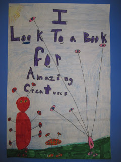
The contest theme was "Look to a Book" We had a lot of fun brainstorming on the white board with all the reasons you might look to a book. The kids thought of everything from relaxation, escape, and adventure, to finding recipes, doing research, learning about new things, and much much more. This project was big challenge and I am so proud of my kiddos!

Here are some more samples of their beautiful posters.