Pages

Monday, November 25, 2013

NYSATA conference part 1 - Tooling Foil!

What a crazy few days!
'Marcel the Shell with Shoes On' made by an attendee at the tooling foil workshop I taught.
I've been in Albany NY for my annual NYSATA conference.  For the first time in years, the conference was an hour from my home, held in our capital/eastern region!   I'm on the Board of Trustees as a region rep, so my conference began with a BOT meeting Thursday night and I didn't stop until I drove home this afternoon. I taught three workshops of them (two of them hands-on), I came up with the idea for and arranged for a Region 6 sponsored 'Bling your Badge' table (which was a real hit!), and helped set up for a regional hospitality party.  And I attended some workshops, heard a fabulous speaker (and unfortunately missed the others due to conflicts), visited with the distributors, and attended a fun TASK party last night too.  It was a terrific conference, and I have so much to share that it will take two or three posts!
Tooling foil dog by workshop attendee
So I have a lot to tell you about, but I've chosen to start with one the hands-on workshops that I taught, "Oh What a Relief - Amazing Tooling Foil!"  We had an hour and 50 minutes, and I'm going to show you what my workshop participants learned and did!  All images in this post are of work done by my workshop participants.
 
Attendees started by drawing a plan on newsprint.  
Hint: for achieving deep relief, use enclosed shapes.  Pattern and texture will be added later.

Once the drawing is done, tape it to tooling foil, put a piece of felt underneath for padding, and trace it firmly with a pencil or pen.  Make sure you label the back, either with a Sharpie, or with a piece of tape.
 If a shaped piece is desired, cut with scissors about 1/2 inch outside of drawing, before removing drawing.   Sorry I'm demonstrating sidewaysin this pic!
 Smooth down edges on a flat surface, using a Popsicle stick or other flat tool.  This amazingly will lessen the sharpness of the edges.  I don't know why, but it works like a charm!
 Then retrace the lines more deeply, using a blunt pointed tool and two pieces of felt underneath.  Once that's done, you can begin tooling areas to bulge outward, working from the back, or areas to sink in, working from the front.  You can also smoothly flatten areas by tooling with a flat tool on a hard surface.  Again, make sure your back is labeled so you don't pop in something you meant to pop out!
 You can fold your felt to have more layers underneath, and continue to tool for very deep relief.  If you get a tear in the foil, tape it from the back.  It won't be visible when you are done.  You should tool every inch of the foil, even if it is just to flatten or smooth areas.  This distresses the metal and makes it a better surface for adding ink to accentuate the design.
You can add rich texture after the relief work is done, using a sharp pointed tool to add pattern or design.  I love the idea of the paisleys in the piece below.  I hope the creator of it sends me a photo when it is complete! 
 Such a variety of work!  Abstract designs, suns and moons, dragons, a dog, sunflowers, a Day of the Dead skull, an elephant, Marcel the Shell, some trees, a fish, some owls, and so much more.  Twenty-six participants, and no two pieces were alike! 
 Finally, time permitting, participants painted the foil lightly with hotel soap, painted it with black Speedball ink, and either rubbed it off with paper toweling, or let it dry and removed the ink with steel wool.   Here's a few finished pieces.  Don't you love the texture and pattern on this fish?
 Look at this coin!  What an original idea!!!! 
We did also talk about how to add selective color; I had several samples.  You can use permanent markers, but my favorite way to add color is to use acrylic paint mixed with Mod Podge to make it translucent and shiny.  When adding color with paint, use single brush strokes to lay on paint without smearing or removing the ink.  Brushing back and forth with cause the ink to smear and the color to get muddy.

And finally, we discussed ways to display the pieces.  You can glue the finished piece to mat board, or another alternative is to glue it to a dowel which inserts in a block of wood.   My students often punched holes in the finished piece, and added yarn, raffia, beads, and more, especially effective on masks. 

Everyone had a fabulous time, and was wonderfully successful.  I love being able to pay it forward by teaching workshops and I love seeing people leaving with a product that they are proud of!!

Sunday, November 17, 2013

Stocking sculptures!

I know, you've seen these kind of sculptures posted elsewhere many times, but I wanted to share anyhow.  My five rambunctious DragonWing Arts students were beyond excited to make these, and didn't want any direction how to paint them.  Evidently they NEVER paint in their art classes in school, so I make sure we do some painting every week I see them.  For these sculptures, I gave them lots of colors, and advice on keeping brushes and paints clean, and let them at it.

 Here they are, hard at work.  And yes, I do have permission to use photos of them on this blog.
 Here are a few views of their work.  I don't know if they are all done, butI know that some are.
 
You probably already know how to make these, but if you have any questions, please ask.  Basically, my materials were galvanized tie wire (2 pieces per sculpture, approximately 2' long, 4x4x4 blocks of wood, nylon knee highs, some old house paint for primer, and assorted colors of acrylic paint.
Next post I promise to get back to some images from MASS MoCA and will talk in particular about the bizarre crash-landed Airstream trailer installation by Michael Oatman.  Bye for tonight!

Wednesday, November 13, 2013

MASS MoCA - the Sol Lewitt retrospective

 With my husband and son, yesterday we spent the day visiting a favorite art museum, MASS MoCA (the Massachusetts Museum of Contemporary Art).  I have so much to share as a result of that exhibit that I will have to divide it into probably at least two posts!  Lots of photos in this post!!!!
A row of hanging upside down trees greet you before you enter the museum!  Why am I always there at a time of the year when they have no leaves? Reminder to self:  Go to MASS MoCA in the summertime!
First, briefly about MASS MoCA - it is, as its name says, a contemporary art museum, one of the largest centers for contemporary visual art and performing arts in the country, located in North Adams, MA, in the lovely Berkshire Mountains. Each time I'm at this museum, there's stuff I love, and stuff I... wellll... stuff I don't love.  But I'll talk about that in another post.  This post is about an exhibit that I most decidedly loved, though it did provoke some serious conversation with my family about what it means to be an artist.  I'll share that concept later in this post.
Me.  Overwhelmed by the huge wall drawings in the Sol Lewitt Retrospective.  I have greatly cropped the wall drawing behind me for this photo.

So - this post will focus mostly on a giant retrospective of Sol Lewitt's giant wall drawings. (Yes, I just used the word giant twice in that sentence.  I'll have to try not to  use it any more in this post.)  This installation will be at the museum for 25 years, so take your time; it will likely still be there when you go for a visit!  Let me share a number of the  pieces with you here, and then I'd like to talk about them a bit, as I said above.  I have photographed people in proximity to the artwork so you can see the monumental size of this artwork. The young man in the white hoodie who appears in several photos, including the one directly above, is my son.  Please forgive me, but these pics are not posted chronologically.  Sorry!


When my son was little, he loved driving around little matchbox cars.  A wall like this in his room would have been great; all those black lines would make great roads for little cars!


 A note about the piece directly above.  I am enthralled.  I would like it to be a wall of my living room.  My husband positively cringed when I told him that.  But can't you just see a sleek couch, in a bright primary color, directly in front of that wall?  It would make me feel so very sophisticated!
 
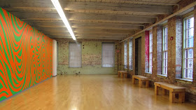
 Please take note that the walls of this amazing museum are as terrific as some of the artwork!
 
 My son thought the lines in this piece looked like lips and butts.  I also saw sewing needles.  Below is a closeup of the lines in this work.
 There's a mathematical thought process for the arrangement of lines in this piece.  Below, a closeup.
 
 
Two walls of straws
 
 Above are extreme closeups of the work below.  It is all made of layers of overlapping pencil and colored pencil lines.  Lots and lots and lots and lots of lines.  They are probably 1/4" apart and cover a huge wall.  Crazy.
The piece below is a small section of a piece, consisting of...well... lines.   The 'artists' who drew the piece on the wall were given Sol Lewitt's directions about how many lines to draw, and information about where lines should go from/to, but a lot of the decisions were made by the actual draftsmen.
Above is a closeup of a section of the painting below.  Three 'artists' painted this wall, one with each color, taking turns painting their line based on the line they were next to.  Does that make sense?
 The painting below is a carefully organized progression of colors.  As in many of the other colorful pieces, the paint is an acrylic ink applied with rags in layers to achieve the desired tones.  The color progression started with gray, then the primaries, then the primaries  mixed with the gray, then the primaries mixed to make secondaries, then the secondaries mixed with the gray, then all of the primaries mixed together, and then all the primaries mixed with the gray. The last two sections are missing from my photo.
So, are you still with me?  I promised to share some of the provocative discussion I had with husband and son as we viewed this exhibit, and watched a short video about the production of the pieces in the show.  I told you we had some discussion about the meaning of the word 'artist' which I have put quote marks around in paragraphs above, as well.  So here goes...

The exhibit is a retrospective of Sol Lewitt's work.  But the actual drawings on the walls were created by others, according to his specifications.  But his specifications were not always totally specific. For example, the specs for one piece might say to draw a certain # of straight lines and a certain # of curved lines that intersect in a specific # of places, but then it is up to the person who puts it on the wall to determine exactly where those lines go.  The people who drew and painted these lines and colors all over the walls were referred to in the video as artists.  There was a huge wall-size chart of who was doing what, and when.  It was complex choreography.  But is someone an artist who simply places colors on a wall according to specs?  Or are they just draftsmen/ladies?  Or is someone an artist who simply gives someone specs to follow but doesn't actually paint or draw the colors and lines?  Who is the artist here?  The person with the creative inspiration, or the people who brings that inspiration to life?  What do you think?

We couldn't come to an agreement, but we did nevertheless enjoy the lively fun colorful work.  Meanwhile, I'll be talking more about the nature of art when I post again, in a couple of days, about the other work that we saw in the museum.  

Please weigh in with your opinions! I'll close here with a couple of visual reflection photos from the museum.  By the way, all these photos were shot with a Canon Powershot point and shoot camera.