Pages

Saturday, February 27, 2016

Wild beasts, wild patterns, wild colors!

Cheetah by Sylvia, grade 2
My DragonWing Arts students were introduced to Henri Matisse, and his use of both bright colors and repeating patterns in his paintings.  We talked about how he and his contemporaries were criticized for their wild use of color, and were nicknamed "fauves" which means "wild beasts".
Zebra by Mackenzie, grade 4
So, my students drew and painted wild beasts!  To be specific, they selected from the wild animals of Africa, and incorporated both bright colors and repeating patterns in their paintings.

To begin, students examined pictures of their selected animal, looked for the basic shapes in their bodies, and practiced drawing them in their sketchbooks.  Once they had practiced, the animals were drawn with yellow chalk on white sulphite paper that had been cut to 15"x 21", Chalk was used for three reasons: to encourage the kids to draw large, to make it easy to wipe off (erase) and adjust the lines, and to eliminate having pencil lines that would show through the paints.
The animals were painted with fluorescent tempera paints.  When dry, black Sharpie was used to outline the patterns on their bodies, and also any details of the painting.  The elephant below is not quite complete, as the artist was absent for one class.  The ear, eye, and mouth will be outlined, which will help define the animal.
Elephant by Joe, grade 3
Meanwhile, on a sheet of 18"x 24" white paper, a 1-1/2" border was marked off with pencil. The borders were left white, and inside the border, the rest of the paper was painted with black tempera. When the black paint was totally dry, white patterns were added by stamping various items, including the ends of cardboard rolls, dowels, and pencil erasers; also the edges of cardboard squares, and pipe cleaners shaped into zigzags. As you can tell, this was a fun activity!
The animals were cut out and glued onto the black and white paper.  The white border was decorated with animal print paper, and, in the case of the zebra, also turquoise metallic paper.  Finally, the projects were glued onto sheets of 20"x 26" fluorescent poster board!
Giraffe, by Forrest, grade 3
By the way, the animal print paper, the colored metallic paper, and the fluorescent poster board all came from Pacon.  I had developed a lesson for Pacon using their new plastic poster board, and to thank me, I was given the opportunity to select $100 value of any products in the Pacon catalog!  These papers were among the materials that I selected.  Thank you, Pacon!  A small business like DragonWing Arts can't always afford purchases of these niche products.  By the way, I wrote about the plastic poster board, here and here on the blog, and one of the lessons I developed using the poster board will be distributed at the Pacon booth in the vendor area at the upcoming NAEA convention in Chicago.

Coming soon, here on the blog, more wild and wacky fauve wild beasts, this time made from papier-mache!  Here's a little teaser for you!

Monday, February 22, 2016

As per your requests - Wampum Weaving Planning Graph!

Over the years I've had this blog, my various posts about 4th grade wampum belt weaving project, using pony beads, have been among my most popular.   You can find these posts here, here, here, here, and here.  Yup, that's 5 different posts, some with samples, and some with instructions.
Often, people have landed at one of these posts via Pinterest, where the project has been shared many times and are therefore missing the whole story, since some of the posts are sequential.  So I've give you links to them all so you can find any info you could possibly want, I hope.
I've had numerous requests for the planning graph that we used for designing the wampum belts (that you see in these photos), and until now, I've been unable to oblige.  When I retired, I left all the files and copies with my replacement.  But I've finally snagged a copy, and scanned it, and you can now find a link to it in my Document Weblinks tab on the top of the blog.  Or  if you want even a more direct path to the doc, here's a direct link to it!  Poof!  It's yours!
Feel free to copy it, or as an idea how to make your own.  My students used them to plan their design, to count how many of each color bead they needed, and to follow the pattern row by row when weaving.  There's potentially a lot of math in there for those of you who struggle to incorporate math into your curriculum! Have fun!!

Saturday, February 20, 2016

3 NYC Museums in 3 Days - Day 3, MAD

No, I'm not MAD.  MAD stands for the Museum of Art and Design, in Manhattan.  It's a lovely small museum, and I've been there before, several years ago, for a premiere of the film Hand Made Nation, about the indie-alternative resurgence of DIY crafters in the country.  My talented and beautiful niece, Faythe Levine, co-directed the film and authored the companion book, as well as the book and movie Sign Painters, which I previously recommend HERE on the blog.  But... I digress.
We had walked across the Brooklyn Bridge, one of my long-time goals,but by the time we got to the other side it had gotten very blustery cold outside and our plans to do further exploring in the neighborhood of the bridge were shelved.  But we had a few hours of the afternoon left, and decided that hopping on a subway to get us out of lower Manhattan, and exploring a small museum to get us out of the cold, would be our best option.  We chose MAD, and it was an excellent choice within our parameters.  (I should add, I took a LOT of pictures of the bridge, which I'll mostly save for some other time when I'm not sharing about a museum visit! In the meantime, here's a sampling.   You can see by our clothing and the sky that it was NOT the best of weather.)
 Left, look what we saw with the zoom lens, happening below!  Right, the iconic lines of the Brooklyn Bridge, that you can see in many well-known paintings. 
 Anyhow...
When we got to MAD, we learned that due to changing exhibits, one floor was closed, so admission price was reduced.  As it was, we barely got to see everything there because my husband suddenly felt ill and needed to get out in the air.  (Don't worry, he was fine by dinnertime!) The up-side of leaving when we did was that I didn't get to visit the gift shop, so I think I may have saved a lot of money.  Anyhow, it had warmed up again outside, and he wanted fresh air, so we walked the 25 or so blocks back to our hotel room.  Walking in NYC is one of my favorite things!  Here's what we saw at MAD:
 This is just a small sampling of the amazing sculptural furniture pieces by Wendell Castle.  Above, is a chair!  He used a process of stack lamination, and then began integrating digital technology into the stack lamination process, using 3-D scanning and more.  I'm not sure I understand it all, but the work is gorgeous and I've used a pic of me standing by one of the lamps, at the top of the post, to show you the massive scale of these pieces.
 Below, a chair and cabinet together.  I think I was particularly intrigued by Castle's life story and work because of the life story and how it reminded me of the work of a sculptor and furniture carver of another generation: my own grandfather, Harry Levine, who I've mentioned previously on the blog (you can use my labels or search bar to find these posts).  Grandpa Harry was a Russian-born Jewish furniture carver/sculptor, trained originally in Vilna (now Lithuania), who came to the country in his late teens.  I never met him, but I'm proud to have had a grandfather/artist with two sculptures on permanent display in the Brooklyn  Museum!  But I digress... Here's the chair/cabinet combo I mentioned before:
 And a chair/table combo, below, and a beautiful serpentine lamp.
And there was an interesting video to go along with the exhibit.  Here's a screen image of the artist.  Cool dude!
 The top floor of MAD is artist's studios that you can visit.  This AMAZING work is an installation of 2000 hand-hewn sugar cups by Margaret Braun.  She unfortunately was not in her studio the day we were there.  The yellow cast is due to bad color balance in the photos, that I'm having trouble completing eliminating.  The cups were pure white.
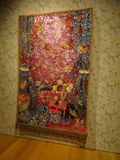
 One the one other open floor, was a fascinating exhibit by Jamaican artist Ebony G Patterson, called Dead Treez.  I had to race through this gallery, because that's when hubby started to feel ill, so my pictures are limited and poor.  There were mixed media installations, and jacquard woven photo tapestries.  The literature and a video that was playing talked about her exploration of class, gender, and race. 
 In the nooks and crannies of this gorgeous installation, there were little bugs and lizards and things, and all sorts of trinkets and jewelry.  I would love to have more time to explore in this display.
 And... I'll close with a few pics from the walk back to the hotel.

Monday, February 15, 2016

3 NYC Museums in 3 Days - Day 2, the Whitney!

 That's me, of course, above.  The artwork is by Ricci Abenda, and, yeah, I suppose it makes me think.  But more about that later...

So hubs and I had plans to walk across the Brooklyn Bridge, but we scrapped the plan till the next day because the weather wasn't good, and instead decided to see the new Whitney Museum, which moved 9 months ago to a completely new location.  A bonus to those of you who (in better weather) like to walk in NYC - the new museum is easy access from the south end of the High Line, which is a former elevated rail line converted into a wonderful walking park.  We did however, walk the Bridge the next day, and the beautiful structure made me understand why there are so many works of art based on this bridge.  Here are two that we saw in the Whitney.  The first, "Brooklyn Bridge", is by Joseph Stella, and the second, called "Region of Brooklyn Bridge Fantasy", is by John Marin.  Tune in, in a couple of days, for my photos of this iconic bridge! 
But anyhoo - the Whitney Museum's collection is American art, and the galleries are set up by era/theme.  Below is Railroad Sunset by Edward Hopper. I love the quiet, lonely sense of peace of this painting. 
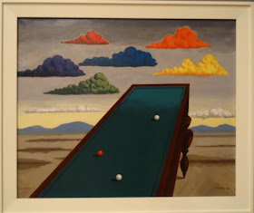
I was struck by a number of images that I thought would be fabulous for teaching perspective, and combining it with surrealism.  It doesn't always have to be a Dali!!
 Above is The Subway by George Tooker; directly below is No Passing by Kay Sage.  
 Below, La Fortune by Man Ray.
 There are some outdoor decks where you can view the city.  In one direction you'll see Lady Liberty, and in the other direction, this.  It was too cold and windy to stay out for more than a moment.
 I liked seeing this David Smith sculpture "Hudson River Landscape".  Smith was from Bolton Landing, on Lake George, just 1/2 hour north of my home.  This piece was based on drawings he did looking out the train window, riding along the Hudson to NYC.  We took the train to/from NYC so I totally 'get' this piece.
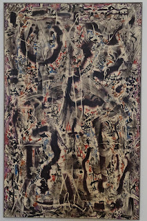
 This large piece, below, really intrigued me. By Alfonso Ossorio, it is called Number 14, and is done with layers of wax and ink, using the wax as a resist, and then scraping off, and repeating, creating an intriguing layered piece. 
 And then, of course, is the marvelous (but hard to photograph) Calder's Circus. Here's a tiny sampling.  The whole thing is such a joy, and I think is a great lesson inspiration.  You don't have to have fancy sophisticated materials to make art that people will love.
 Now here's where things got a little dicey in the museum.  My husband tries to be kind, but his immediate response was "Get me some lockers.  I'd be happy to crush them for you."  Yeah....
 And then there were these sinks, "The Ascending Sink" by Robert Gober.  It's a couple of sinks, screwed to the wall...
 And the painting at the top of the post, and this, below, by Richard Prince.  It seems every visit to a major museum has us scratching our heads in at least one room. 
 Then we came across this., also by Robert Gober (the sink guy).  I ended up in a conversation with another museum patron, trying to puzzle it all out.  The tag calls it  "Newspaper" and for medium, lists it as "photolithographs with twine".  It is a pile of newspaper.  Now, it happens that, coincidentally, the big headline, from 1992, happens to be about lead in the drinking water, making this very timely, at the moment.  But still, the question is, what makes something "art". 
 It is certainly a definition that is changing, though I am still hung up on the concept (whether or not, on this particular piece) the headline happens to timely at the moment) that art is something that is interesting or intriguing or beautiful to look at.  I know that is not the only definition any more, but it still doesn't help me understand how someone can stencil some letters on a canvas, or tack a couple of sinks to a wall, or crush some lockers, or pile up some newspapers, and achieve recognition for this as an artist.  Where did that "artist" make the leap from learning about the Elements and Principles in art class?  How did he or she move from putting together a portfolio of work to get accepted into an art program, to getting recognized for displaying a sink?  Help me out here, folks....
Anyhow, I;'ll close with a few more pieces I liked.  Above, puppets by Phillip Parreno.  Below, a painting that I became very fond of.  My photo of it isn't great, but I love how, while it looks like an aquarium, it also looks open into an abyss.  It makes me happy. 
 And just for fun, these colorful pieces put a smile on my face.  My husband, not so much..  I apologize; for some reason I'm missing the artist's names for these final 4 images, and the color balance on my photos is a little off, but hopefully it's enough to intrigue you, too!!