Showing posts with label elements of art. Show all posts

Thursday, August 27, 2015

Pacon Plastic Poster Board - part 1

 I have been lucky enough to have an opportunity to test a new product for Pacon to develop some lesson ideas for its use, that will eventually be posted on their website.  The product is Plastic Poster Board, and I've gotta tell you, I kinda LOVE this stuff!  So much possibility!  The poster board is 22"x 28", and I received an assortment that included a selection of black, red, yellow, azure blue, fluorescent green, fluorescent pink, and clear.  The clear is, to me, more translucent than clear.  It also comes in white but my pack didn't include any white.
When I started playing with it, Matisse's cutouts, such as the one below, immediately came to mind.  I also  thought about Calder's mobiles, and the colorful paintings of Stuart Davis.
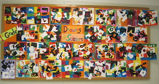
So I cut it into rectangular chunks, and then, while sitting in the passenger seat of hubby's car on the drive to Maine, I did some "drawing with scissors", saving all the negative and positive shapes from my cutting.  My original idea was to use these cutout shapes to make mini collages to hang in a window perhaps, or to string the shapes together to hang in a Calder-esque window mobile.  But instead, I ended up gluing larger collages, beginning with the first two pieces at the top of the post.
Then, especially smitten with the translucent stuff, I made the collage above and glued it on the translucent board.  This could easily be hung on a window.  Thinking about lesson development and the Elements of Art and Principles of Design when I made these pieces, I set myself some parameters.  I made sure that each piece included at least one positive and one negative shape, and at least one geometric and one amorphous shape.  I tried to create a successful composition using asymmetrical balance.  I used repetition, movement/rhythm, contrast/variety, unity/harmony, and so on.  I experimented with backing it using a piece of white tagboard,
 Or a piece of blue.
 Here's a better view of its translucency.
 I decided to play with some Sharpie paint markers  on the piece.  I drew line designs on the BACK side with a white blue, and red paint marker, and on the FRONT with a black marker.  Here is the finished piece, placed over a piece of black.
 I used some more pieces that I'd cut, including some translucent strips, to make this quickie collage on blue, below, and then I used the Sharpie paint markers on the front.
When I held it up to a window and let the light glow through, the blue looked really great.  It occurred to me that it would be fun to make 'fish tanks' to hang in a window, or perhaps portholes.

I made this final piece below using even more of my cutouts.  For this piece, I decorated the front using a black Sharpie paint marker.  Perhaps I went a little too pattern crazy? 
  A few things fun facts about the plastic poster board -
  • It is WONDERFUL to cut.  Your scissors will glide right through it.  Your students will love cutting it!  It will serve as a wonderful alterntive to construction paper for many collage purposes.
  • And of course, unlike paper, it is not going to rip.
  • Plus, the colors are not going to  fade, (at least that's what I think).
  • The colors are limited, but they are rich and bright.  Very appealing!
  • For flat work, Elmer's Glue-All or glue sticks hold quite well.  I was actually surprised; it glues together much more effectively than, for example, colored sheet foam.  (Since it is not porous, you will always be able to pull pieces off glued with Elmer's or glue sticks.)
  • Sharpie paint markers work fabulously on it.  Regular black Sharpies also work well on all colors of the board (except the black, of course), and, on the translucent board, you can use any color Sharpie, including metallics.
  • I discovered that the Playcolor tempera stick samples, including metallics, that were given to me by a vendor at last spring's NAEA convention, also work effectively on the plastic poster board.  
 My next post will be a completely different art project idea that I developed  specifically for the 'clear' translucent Plastic Poster Board.   But in the meantime, one last image.  The pink fish is a positive/negative cutout image, with both pieces glued onto one piece of blue.  The two fishes were colored the same way, using the paint markers yet again.
So many other other collage ideas...  Funky colorful cities, haunted house collages with windows, Picasso-style cubist silly portraits, and so much more.  Can you tell I like this stuff???  What are your ideas?  Funky flowers?  Crazy cars? Cutting shapes to string as charms on necklaces or earrings?  What else? 

Once I have completed writing up the step-by-step lessons, complete with Common Core standards, and they are posted on the Pacon site, I will let you all know the link to find them!  In the meantime, feel free to ask questions and if you get a chance to use this stuff, GO FOR IT!!  You won't be disappointed. 

Monday, June 15, 2015

My doodles are not Zentangles

 I'm a compulsive doodler, and I've written about it several times before in my blog.  What I create are doodles, not Zentangles.  I want to talk a little here about the difference, and why you haven't even seen and won't ever see me presenting Zentangle art lessons here on this blog.  By the way, all images in this post are from the latest of several little sketchbooks I take with me to meetings or workshops, so that I can keep my hands busy while I focus my mind.  They are done mostly in a combination of black Sharpie and a set of multicolor Flair pens.

I first wrote a blog post on the topic of Zentangle vs doodle in March 2011, and while it is not in my list of most popular posts, it has certainly sparked more response than most other posts.  As a matter of fact, it has received more comments than any other post I've done since the inception of this blog, with today's total of 60 comments (yes, some of them are my responses to commenters, but there's still a lot.)  New comments still frequently appear on that post, so I know it is still a topic of interest.  I also wrote another post about doodling here, with the link to a great TED talk on doodling, too.
 
So why am I writing another post on the topic today? I've actually been planning it for quite some time, but I would see posts written by other bloggers, or in the Facebook Art Teacher group, about projects/lessons taught that incorporated Zentangle, and I did not want anyone who wrote these posts to think that my blog post was referring to them directly.  So I waited until a 'neutral' time to write this.  This blog post is not directed at any specific person but is intended to make you think about what you teach and why. 
 Here's my concern.  Throughout my long teaching career, my students did lessons and projects that incorporated line, texture, shape, balance, repetition, rhythm, pattern, unity, contrast, and so on.  If you are an art teacher, these words should be very familiar to you, since they are all part of the basic Elements of Art and Principles of Design.  The word 'Zentangle' appears nowhere in the Elements and Principles, nor will you find it in your Core Art Standards or in the Mathematics Standards either.  That's because Zentangle is a trademarked method taught by CZTs (Certified Zentangle Trainers).  In other words, it's a money-making business.  They teach classes and sell products. 

Searching the web, I came across a wiki that gave this definition: "A Zentangle is an abstract drawing created using repetitive patterns according to the trademarked Zentangle Method. True Zentangles are always created on 3.5 inch (8.9 cm) square tiles, and they are always done in black ink on white paper."  It further went on to say that it should without orientation (no up or down).  Already, I certainly know that MY doodles don't qualify.  Mine often incorporate color, they absolutely do have a certain intended orientation, and they are not square.  Further, they do not include the pencil shading that is a part of the Zentangle method.  
Then then I went to the official Zentangle® website, and I learned that "Zentangle's teaching materials are subject to copyright owned by Zentangle." According to the website, they have a patent pending on their teaching method.  Also, I found this: "Many aspects of the Zentangle® Method, including our materials and teaching tools, as well as the material on this site, are covered by copyright which is owned by Zentangle, Inc. All rights reserved."  (So it's a good thing I'm not calling my drawings Zentangles, I guess...)

If you are doing a project with your students that includes drawing something with a specific shape (whether a cat, a tree, an owl, a flower, a whale, an ice cream cone, or whatever...) and a major part of that lesson involves having your students divide up the internal space of the subject and fill each part with repeating patterns, rhythmic designs, or repetitive textural lines, WHY are you calling it a Zentangle?  Isn't it really a lesson on repetition?  On line?  On implied texture? And so on?  You can reference almost every Element and Principle in such a lesson, and that is much more valid to justify as part of your curriculum than calling it a Zentangle!  I would think your administration, looking at your curriculum, would much prefer seeing that you are teaching long-established elements of art and principles of design.  (Just my opinion, I know.)  As a matter of fact, I could probably dig through my ancient School Arts magazines and other resources from my early days teaching elementary art, and find many articles on lessons using repetitive pattern and design that were published before Zentangle® was ever conceived!
 Let's try to put this another way.  I love papier-mache.  Let's say I invent a specific papier-mache mixture, call it "Dragon Drool" (which is already the nickname my students use for mixed Art Paste), copyright it and sell it, train and certify "Dragon-Droolers" in training sessions that cost money to attend, and copyright my specific method calling it "Dragon-Drooling".  Now, every time you use papier-mache, should you be referencing my copyrighted name, even though you might not be doing the process the same way, or using the same material?  Even though you haven't been trained in Dragon-Drooling by a CDD ("Certified Dragon-Drooler")?  No!  You simply call it a papier-mache project!  Similarly, unless you are a CZT, and are using the specific process and materials outlined in official Zentangle classes, should any lesson in repetitive design be called "doing Zentangles"?  

I'd love to hear your thoughts.  In the meantime, please understand; this blog post is in no way criticizing the Zentangle process or the people who teach it.  I simply don't think it's what we are actually doing when we are teaching art to kids!

Monday, February 2, 2015

Matisse's cutouts and teaching art

 It's no secret to readers of this blog that I am a Matisse fan.  Truthfully, my favorite Matisse works are his portraits and models and room interiors and still life paintings, ablaze with vibrant, intense, and bold colors, especially those with rich patterns and lively compositions, and frequently with my personal fave, red.
But I also love the playfulness and vibrancy of his cutouts, so I made sure to get to NYC to see the exhibit of the cutout work at MoMA.   The sword swallower below is from the book Jazz
I own a copy of Jazz, but the flattened colors of the reproduced images do not properly represent the vibrant painted paper used in the actual cutouts.  I learned that he painted his paper for the cutouts using gouache, and oftentimes in the cutouts you could see subtleties of variation in the values of the colors that are not in evidence in reproduction.  These subtleties make the works so much more interesting to see.
A year ago, on a trip to the Whitney, we spent some time viewing Calder's Circus (above), and I couldn't help when I looked at many of the Jazz circus-inspired images on the wall, thinking how well the two works of art, would partner together in an exhibit, perhaps with the circus in the center of the gallery, and the Jazz work surrounding it on the walls.  They both have the joy and playfulness to perfectly complement each other.  And both of them show a looseness of expression, and are reminders that we shouldn't take ourselves or artwork too seriously.  We should experience joy both in the making and the viewing, I think!  And I love that one is made from random recycled materials, and the other is made from cutout scraps of paper.  A perfect pairing, don't you think?
 My limited photos do not do justice to the cutout show.  This wall, above, was a pop of vibrancy when you walked through the doorway of the gallery.  So lively and colorful!  Again, so joyous! I think this exhibition was absolutely the BEST art exhibit for teaching art.  There were so many lessons to take back to the classroom.  While I apologize that I don't have the appropriate images here to illustrate, the images are easily found on the internet.  These are some good teaching points to remember:
  • Matisse didn't pre-draw all his cutout shapes, though for large scale pieces such as The Swimming Pool or the work he did designing a church, much pre-planning was essential.  So pre-planning really depends on what you are  doing!  Sometimes it's good to give scissors and paper to kids and let them see what happens, without too much direct instruction.
  • When Matisse cut out paper, he frequently made use of the negative space shapes as well as the positive shapes.  In this Matisse-based lesson I did with 1st graders and blogged about 4 years ago here, the students used both the positive and negative shapes in their lively cutout collages.  Just click on any one of the links in this paragraph and you'll see what my 1st graders did in this Matisse lesson.
  • Matisse, with the help of an assistant, did not glue his collages together without moving things around, a lot.  When you look closely at the pieces in the show, you can see all the pinholes, from the pieces being moved around so many times.  (There were even pieces on display that still had pins or tacks in them!).  When I do collages with my students, I often give them a zipper baggie for their pieces, and do not allow them to glue them together until they had been arranged and rearranged several times.  Here's a link to a post with some surreal collages done by my 4th graders, where we used the baggie method of collecting collage materials.  It's important to remind kids that the first answer isn't always the best one.  Moving things around, even pinning them and asking for critique, is a great way to improve your composition and overall design.
  •  Think about all the elements and principles you can talk about when teaching about Matisse's cutouts!  Color, of course, and believe it or not, Value!  Line!  Shape!  Repetition! Rhythm!  Movement!  Balance (symmetrical and asymmetrical)!  Should I go on?  Matisse's cutouts may well be the most 'teachable' artwork I've ever encountered. 
 And for the kid who says "I can't draw", is there anyone who can't cut out some wavy lines and wiggly shapes with a scissors?  Matisse's cutouts do not intimidate kids who are less than confident in their abilities. 
And for the kid who says "this is stupid; what is this for, anyhow?" you can tell them that some of  Matisse's designs, similar in scope to the piece above (garden with parrot and mermaid; mermaid is not visible in this photo), were designed for patios.  He designed stained glass and walls for a church, as well as clothing, and more. Some of his pieces were designs for rugs.  In other words, his designs became part of functional interior/exterior design and clothing design.  And I'd be happy to have any of them on my patio or in my home or worn on my body!

And for anyone with a physical disability that keeps them from doing things one particular way, Matisse is a role model.  When his health prevented him from painting any more, he came up with a new way to create art.  And in the end, he thought it was the purest and best artwork of his career!  What a motivation this could be to anyone who says "I can't!"

Tuesday, June 18, 2013

The way I do things


plaster bandage finger puppet
 I've been involved in some discussions in an art teachers' group on Facebook, and a recent discussion prompted me to write this post.  I was asked about my curriculum.  So today, I'm going to share my personal philosophy of teaching art, with a rundown of the way I ran my program until my retirement.  It's not so much a curriculum as it is an overview, a general plan.  If you are a long-time reader of this blog, you probably already know a lot about this.  But if you you have recently found your way here by way of the Facebook group, or Pinterest, or an Internet search, there's a lot you don't know about me and my teaching style.
*By the way, I am filling this post with a random smattering of student artwork.  It will not always match the text.  I just want you to see the type of stuff my kids might have done in my program.
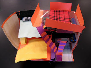
4th grade room design construction


So, some background.  (Feel free to skip this paragraph if you are not interested.)  I am one-year retired, after 36 years teaching.  I began as a high school art and photography teacher, but spent the last 27 years in the district that I retired from, teaching elementary and some middle level art.  This job was in a small rural school district in northern NY, about 500 kids in the whole district.  For the first 14 or so years in this job, I taught in two buildings, in two tiny towns.  When I began, my classrooms were either nonexistent or inappropriate, and shared.  It was not ideal, but I did not let it hinder the creation of art.  Then my district got some funding and abandoned their three inadequate schools and built a central Pre-K-12 building. The high school art teacher and I suggested that our rooms be central to the building and adjoining, so that we could share expertise.  Instead, we were placed at the extreme opposite reaches of the large building.  Our schedules didn't jive, so we never saw each other.  In other words, my art program existed as an island, and I was really on my own for deciding what to teach and why.  Until I began blogging three years ago, my only contact with other art teachers was, for the most part, my attendance at annual conferences.  So I figured things out for myself.

Andy Warhol inspired cat paintings, grade 3
I have an extreme distaste for jargon.  Giving things fancy names doesn't validate anything for me.  And frankly, I learned very little jargon in my hippy-dippy college education in the early 1970's.  Over the years, I have seen all sorts of initiatives come and go.  There have been been local and statewide and national regulations and programs.  There have been professional development programs in my district, where the 'specials' teachers were practically ignored.  There was the NY State Regents Action Plan of the 80's.  In the 90's nationally there was Goals 2000.  Locally there was Learning Focused Schools.  And of course, No Child Left Behind, Race to the Top, and now the Common Core.  After seeing so many changes come and go over the years, I am always skeptical about investing too much in a new initiative, since in a few years something else will come along.  But while I miss my students, quite frankly I'm happy I retired before I had to deal with the new direction in education, which seems to spend way too much time devoted to assessing and assembling data and less time for the joy of actually teaching and learning.  This one seems like it might stick around.  Anyhow...

 Here's what I believe:  I believe that art class should be a hands-on opportunity for kids.  If you are afraid of making a mess you should not be an art teacher.  The good thing, of course, is that you will have less behavior problems if your kids are actively engaged in hands-on experiences.  Don't give up those messy materials for something easy to clean up due to lack of space, time, or energy.  You are cheating the kids.
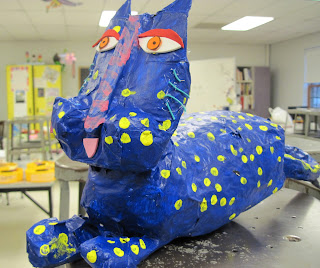
5th grade special education student's papier-mache Laurel Burch inspired cat
 I do not like the idea of spending elementary art class time giving tests.  I also have no interest in learning about incorporating iPads or other technology into elementary art programs.  The kids spend so much of their time now, both in school and at home, in front of a screen, using some sort of technology.  So I believe an elementary art program should be the one guaranteed opportunity during the day for tactile experience.  I want students to experience dipping a brush into thick creamy paint, squishing their fingers through clay or papier-mache goo, squeezing Elmer's Glue-All out of a bottle, cutting, tearing, weaving, drawing, painting, and creating.
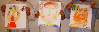
expressing emotion with thought bubbles
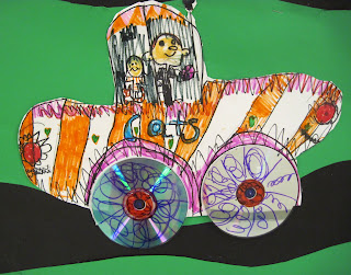
Rizzi cars!

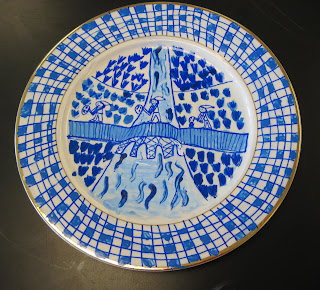
6th grade Blue Willow inspired plate design

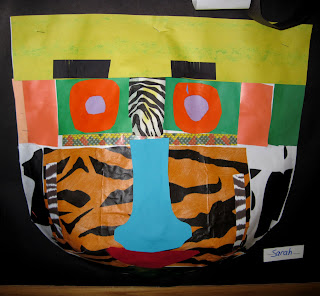
leftovers mask

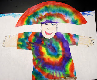
coffee filter creation

no explanation needed!

By the time they left my program, I wanted my students to have experienced drawing, painting, collage, printmaking, cutting, gluing, weaving, constructing, and more.  I want them to learn to use their eyes and their imaginations, to find creative solutions to challenges, and make independent decisions. I wanted to expose them to a variety of well-known artists, art trends, and cultures.  I wanted them to learn to appropriately use and clean up art materials responsibly, and be good class citizens.  And certainly I wanted them to have an understanding of how to use line, shape, color, etc effectively in their artwork.
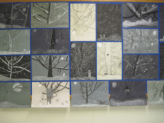
4th graders learn to use charcoals and draw trees
 I had a NO WHINING, NO COMPLAINING policy in my room; the art room should be a happy place.  I wanted and had a program flexible enough to change directions for something exciting, a spontaneous learning experience.

As for specific curriculum - what I actually taught - I do need to say it varied from year to year.

I did not drill the Elements and Principles of Art (though posters hung on my bulletin board all year and were frequently referred to), but instead incorporated them into every lesson.  I think it is more important for kids to understand how to use line and color and texture, for example, than to memorize facts, though vocabulary was added to my word wall all year.  I found that almost every art project uses more than one or two elements, so to say "this is a line project" is kind of limiting.  Perhaps we are using line to create the illusion of space, using line to create shape, using line to establish rhythm or movement...  Perhaps the color of the line is significant.  Perhaps the lines you are using create value and texture... you get the idea, right?

I also introduced students to the work of 'famous artists' and art movements and incorporated these into projects throughout the year.  I kept careful track of the artists I introduced, and varied them from year to year so that we could study one artist across several grade levels.  One year might be VanGogh, Mondrian, Cassatt, and Jackson Pollock; the next could be Chihuly, Rizzi, Lichtenstein, and Janet Fish; and the next might be Nevelson,  Matisse, Klimt, and Frank Lloyd Wright; and the next could be Arcimboldo, Kandinsky, Warhol, and Grandma Moses; and so on.  Sometimes artists/styles were displayed and studied together - such as Dali and Magritte.  Or perhaps I might display landscapes/seascapes by Cezanne, and Monet, and Winslow Homer.  Or self-portraits by everyone from vanGogh to Rembrandt to Suzanne Valadon. Or we might compare/contrast Frank Lloyd Wright with Victorian architecture.
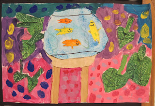
Matisse-inspired painting/collage
a little art room cleanup!
1st grade Matisse inspired painted collages
3rd grade drawings
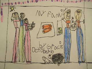
1st grade family portrait

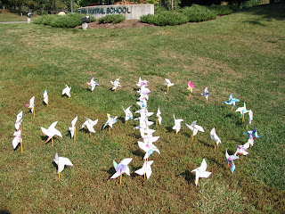
Pinwheels for Peace installation
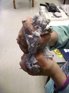
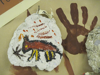
All grade levels used a variety of materials and created both 2-D and 3-D art every year.  For storage purposes, I 'choreographed' the 3-D projects so they did not happen all at once.  I did papier-mache with grades 3-5 every year, though I rotated the projects so I wasn't doing the same thing each year.  My 6th graders always did some sculptural project with plaster bandage.  (I saved the more pricey materials, such as the plaster bandage and tooling foil for the 6th grade, who were my oldest students in recent years.)  I only had air dry clay, so I used it just with the younger grades. Certain 3-D projects came to be expected every year: My second graders always made cardboard 'teddy bear chairs', and my  first graders made cardboard sculptures. 4th graders used shredded paper clay (messy!  fun!) to create hunks of 'cave wall' when they learned about Lascaux and the origins of art.
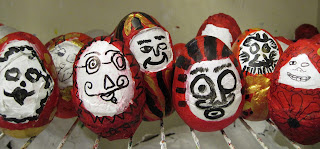
papier-mache Darumas, Japanese inspiration
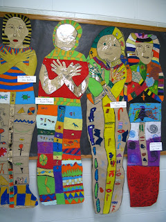
6th grade mummy cases with hieroglyphics
We often used other cultures for inspiration.  The 6th grade academic curriculum in particular was easy to coordinate with - for example, we always did something Egypt-related.
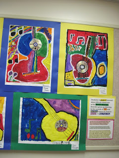

paintings by grade 2
Every year, as much as possible all my students would use/experience:
  • Watercolors, tempera and acrylics.  Painting would include using both traditional brushes, and non-traditional, such as Q-tips, cardboard scrapers, fingers, squirt bottles, rollers, etc.
  • A variety of drawing materials including possibly pencils, crayons, chalk pastels, oil pastels, colored pencils, markers, and more.
  • A variety of collage materials.
  • 3-dimensional materials such as papier-mache, plaster bandage, clay, cardboard, fibers, etc
  • Grades 3 and up were exposed to perspective, with the understanding and challenge of what we did a little more complex each year.
  • Drawing from life - whether it was 1st graders 'modeling' for the class to draw, or the time we brought in animals (a parent did taxidermy), or a still life setup, or contour drawing from objects in the room; I much rather kids draw from life than copy photos when possible.
    toothpaste batik in process

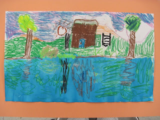
    reflections

    making 'rock' for cave wall paintings


    grade 1 - 'I have a little shadow'
    kindergarten collage
     While I am not going to go into detail, I had (have) a document that details 'exit goals' - so that students leaving my programs at the end of grade 6 would be expected to have experienced. everything on my list.  
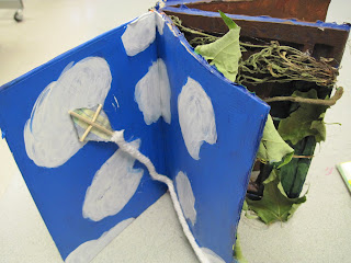
6th grade altered book
I tried to foster independence in my classroom, and have students 'take ownership' of their work, their behavior, and the care of my room and materials.  I did not use templates, except rare instances.  (A circle tracer would be acceptable, for example.)  To me, by having everyone trace a template so that 'everyone's work turns out good' takes ownership from the student.  He is more likely to say 'I can't draw a cat' for example, if every time you draw cats in the art room you give him one to trace!  Instead, give him the experience/tools/practice to learn to draw that cat on his own, and he'll take ownership of and be more proud of his work.  Does this make sense to you?  My goal isn't simply to have the students create a nice product, but to give them the tools to use their own decision-making and  make a product that they really 'own'. 
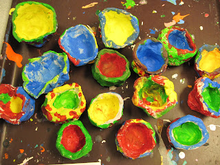
kindergarten pinch pots
from the Salvador Deli
cave wall hunk

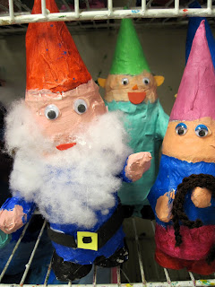
papier-mache garden gnomes, grade 3


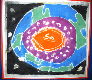
toothpaste batik
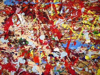
collaborative Pollock painting
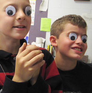
silly kids
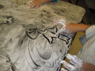
shaving cream!
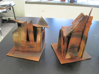
4th grade cardboard crooked houses
Hubby is waiting for me to go somewhere - gotta run!  I hope this post isn't too long and convoluted!  And I hope I finished it!  Let me know if you have questions about particular artwork posted, or anything else!