My DragonWing Arts students recently finished some colorful paper weavings. I posted some pics on Instagram and received some questions and comments, so I thought I'd share the (simple) details here. It was an easy and successful project!
The students each were given three sheets of 12x18" white paper. They divided two of the papers into stripes lengthwise, and painted one with warm colors, and the other with cool colors. The paints were fluorescent tempera, and they used one brush for warm and another brush for cool, but did not wash the brush between colors, so that they got some subtle color blends in their stripes. The third sheet of paper was filled with shapes - the kids chose to use hearts, stars, and 'amorphous blobs' (random organic shapes). The shapes were painted with warm and/or cool as desired. Then everything was outlined thickly with black paint. Finally, we used Sax Tempera Gloss Varnish to paint a coat of shiny sealer on the paintings. It really enhanced the colors!
The students each were given a 19" square of black poster board. They cut the stripes from one painted paper, cutting right down the middle of the black lines, and glued down the ends of the stripes, side-by-side on the poster board, to create their warp.
Then they cut the stripes on the second paper, and used them as weft, to weave through the warp.
When the weaving was complete, all the ends were glued down, and the shapes were carefully cut from their third papers.
I had been given a bunch of 3D-O's, and we decided to use them to make the shapes 'float' above the weaving. Note the 'happy face' arrangement of the stars in the piece below!
I know it's hard to see the 3-D element in these photos; it definitely looks more effective firsthand. But honestly? I'd never used 3D-O's before and the kids and I found it annoyingly difficult to peel the end papers off to reveal the sticky parts. Next time, I'd prefer to cut little squares of heavy cardboard and have the kids glue and stack them under their shapes to create desired depth, in place of using the 3D-O's.
The original motivation for this project was a pic I saw on Pinterest, using warm and cool colors to weave in contrasting directions, in layers of weaving. There were no instructions, and I used the image simply as a starting point to develop my own project for my students. I thought the floating shapes would be a fun enhancement for the basic weaving, since we weren't working with multiple layers. I also thought the contrast of using fluorescent paints and black lines made the final images more lively.
I can imagine lots of ways to further enhance the project - patterns in white on the black backing, perhaps? Or black and white patterned strips woven through diagonally? It's fun to imagine all the possibilities!!
Showing posts with label warm colors. Show all posts
Thursday, February 15, 2018
Sunday, January 28, 2018
Teeny Tiny Looms!
DragonWing Arts is my little business of after-school art enrichment classes for students grades 2-5. We are back in session for the winter! Our theme for this winter session is 'Wonderful Winter Weaving'. My current 5 students (one 3rd grader, two 4th graders, and two 5th graders) have told me that they've never done weaving in art class, so I figured I couldn't be too confident about their weaving knowledge and skills.
I have an ambitious set of weaving projects I'd like to accomplish with them in our 7-week session, and I wanted to make sure they all understood the basic concept of weaving to make the projects move along easily. So I made some teeny tiny looms - 2"x 3" - out of mat board scraps. I cut notches ever quarter inch, and then strung the looms, wrapping the warp around the back and tying together the two ends. The photo above is the back of the looms; you can see the front in this pic below.
The kids started weaving, using blunt big-eye needles and yarn. I had them measure yarn from their nose to their fingertips to cut. Longer pieces will tangle too easily. Because the looms are so small, if a mistake is made, it can be noticed and rectified quickly. In just a few minutes time, everyone had gotten the hang of the process and all 5 kids were rapidly weaving. We put Popsicle sticks under the warp to make it easier to get their needles under the warp as weaving was progressing.
When the weavings are complete, the kids will have the choice to take them off the looms or keep them on. (I'm going to recommend taking them off.) We will cut the warp on the back of the looms, and knot them together in pairs. I think they will make cute little woven pendants! I promise to post pics of them on the blog when they are finished.
Meanwhile, we made some warm and cool painted paper for another weaving project, and everyone started weaving on looms made for little pouches. I'll do full blog instructional posts on both of these projects when they are complete, but in the meantime, the pic below is an advance preview.
Friday, June 17, 2016
Warm and Cool 3-D Cityscapes
Yes, I know the windows are totally incorrect in the painting above. Ignore it. The 3rd grade artist who painted it was happy and so am I. Below, another 3rd grade painting.
I realize this is a project you've likely seen posted in many variations, on all sorts of blogs, including right here on this blog! But anyhow, I thought I'd share the variation done recently by the two second graders and two third graders who attended my spring "Scapes" session of DragonWing Arts, that I've talked about before on the blog. These, obviously, are cityscapes. The next two paintings below are by 2nd graders.
It is "fake perspective" - a way to get young kids to make things look 3-D without actually teaching them about vanishing points yet. I like to wait to teach linear perspective until the 4th grade, when I think the kids are beginning to be developmentally ready to understand the concept. Still, there will be some kids won't "get it" then, or ever....
We began by drawing arrows pointing straight up, and then drawing a line straight down from each point of the arrow until it meets the bottom of the paper, or until it bumps into another building on the way down.
Once the drawings were done, I gave them warm colors of tempera, and told them they could paint either the buildings or the sky, but not both. One child chose a warm sky, and the other three picked warm buildings.
In a subsequent class session, I gave them just cool colors, the paint the opposite part of what they'd previously painted. I didn't take pictures of the kids that day, because they wanted to keep their work secret from their parents until the last day of class! They knew I'd be posting them and that their parents would look!
Finally, the kids used long cotton swabs to outline. I gave them white and/or black paint; one student chose white, two chose black, and the fourth selected to use both black and white. We were down to the wire getting these done, or I think the kids would have added more windows and details, but honestly, I think they are fun just the way they are, especially with the limited time we had! We quickly glued them on black construction paper and finally onto pieces of bright colored tag for display. We were in such a tight squeeze getting these done, I rushed to shoot pics of the finished pieces, which is why they are not flat and straight in the pictures above! But as you can see, in the photo below, my students were quite proud of their completed work!!!
Saturday, May 24, 2014
Color relationships and a fun optical illusion
Open up the photo above, and step WAY back and look at it. Squinting a little will help. How many colors are there? No doubt you see turquoise, and red, and probably a gold-yellow and a paler yellow. Guess what! The two yellows are actually the identical color! It is an illusion! None of the pieces pictured in the photo below has any more than three colors in it, even though you probably see at least four.
I posted about this intriguing project way back in 2011, but it's a post that hasn't had a lot of views, and it's a really interesting lesson, so I thought I'd share it with you again. This project is designed to show the effect that one color has on another.
The materials are simple: each student will need three sheets of 12"x18" construction paper - two dark colors and one light color. They will also need a ruler, a pencil, a scissors, and glue. That's it!
Watching students decide which colors are light and which ones are dark is actually pretty interesting. I guided decisions if I didn't think their choices would work, but sometimes we were surprised at the outcome. I recommend that the two dark colors be very different from each other - perhaps one warmer and one cooler color. And as long as the two dark choices are darker than the light color, the illusion should work. And if someone really wants to use white for their light, or black for a dark, don't discourage them. You'll never know the result until you actually see it! I had a huge selection of colors to choose from, not just the bright Tru-Rays, but the paler color pastels from cheaper brands. (If you only have the 'good stuff', ask an elementary teacher to trade a few sheets for some pale blues, yellows, or pinks perhaps.)
Then, the papers are labeled in a corner - one dark color is labeled 'A', and one is labeled 'B'. The light color is labeled 'C'. I gave each student a paper clip to hold the papers together at the end of ar class, so they only need to write their name one one sheet of paper (the C paper).
Also on the C paper, students copy the following color pattern off the board. Write it on a corner, near an edge, so it doesn't take up too much space on the paper. Here's the pattern:
A-B-A-B-A-B-C,
B-A-B-A-B-A-C,
A-B-A-B-A-B-C,
B-A... until you run out of paper.
A simple shape, no larger than a quarter, is cut out of the A paper and glued (we used good glue sticks) on the B paper, starting near a corner but not right on the edge. Each time a new piece is cut and glued onto the next layer, have them cross the letter of what was cut off the written pattern. Following the pattern is essential for the illusion to work.
Use the ruler to find an 1/8", and draw a shape around the original shape, larger by 1/8". Cut out the shape, glue it back onto the A paper, and cross it off the pattern. Repeat the process. Over and over again, measuring, cutting, gluing, crossing off, measuring, cutting, gluing, using the A paper, the B paper, and occasionally the C paper as per the pattern. Following the pattern is essential, as one time the C paper will be between two layers of color A, and the next time it will be between two layers of color B, and so on.
The most important thing to watch is that the kids do NOT skip all over the paper cutting and gluing, or they will run out of paper too soon. Start at a corner, and try to snug it in nice and close, each time you glue it down to cut again. Remember, you only need a border of 1/8". Very rarely, if a student does not pay attention to this instruction, you may need to give them an additional piece of paper in order to finish the project. Or, sometimes, if they have a couple of parts of a paper that are too small, you can have them overlap and glue them together to create a larger piece.
Once they are done, have kids hold them up at a distance from other students, and then have students taking turns guessing what colors were used. You'll be amazed. Kids will guess as many as 7 or 8 colors on one illusion. You can't see the full effect here on the blog; you have to try it! The colors chosen will give halos of colors to the others, and the kids will absolutely not be able the guess the only three colors that were used. It's really pretty amazing.
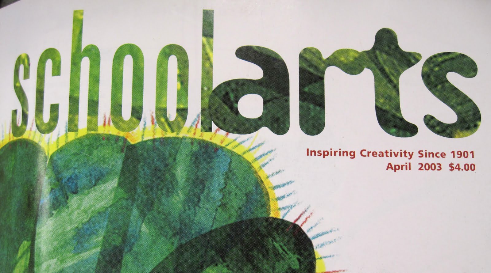
By the way, the original lesson for this was not my idea. I found it right here, in the April 2003 issue of School Arts Magazine!
One last thing - follow-up. Ask the kids how can they think they can use what they learn in their daily lives? Perhaps in clothing choices? In colors they pick to decorate their rooms? I have a purplish carpet in my living room (it is actually subtle blue and red fibers, but visually, it is a dull purple). Years ago, when we had a royal blue rug, the walls were painted a buttery yellow. When we replaced the carpet, and I could not find a tweedy blue like I wanted, we ended up with the purplish rug instead. As a result, because it is next to the yellow walls it looks gray! I can't believe I didn't think about how that would happen when we picked the carpet! (Of course the good side is that you cannot see the cat hair... or maybe that's the bad side?)
Anyhow, try one of these illusions yourself, and you'll want to do it with your students! I did it with 5th graders. You can try younger, if you think the kids could manage the pattern and the measuring, but be warned - if they make the borders much larger than 1/8", the illusion will not be as effective. So I'd do this with students who can carefully measure and follow the pattern. Have fun!
Labels:
5th grade,
6th grade,
art lessons,
color,
cool colors,
elementary art,
optical illusion,
warm colors
Tuesday, October 4, 2011
A little of this, a little of that
Here's some other things we've done to start the year:
Wednesday, May 26, 2010
Warm and Cool 3-D Cities!
My 3rd graders painted these totally awesome tempera 3-D cities! I'm so proud of them!!


We started out by drawing arrows pointing straight up, using a Sharpie marker without pre-drawing. No such thing as a mistake!
Then, to create the "3-D" buildings, the ends of the arrowheads were connected straight down to the bottom of the paper, or until they bumped into another building.
Finally we added our concentric circle skies, which is an idea I adopted from another blogger.


To paint them, we first used a palette of only warm colors and white, to create various colors and tints. The kids chose whether to use them for the buildings or the sky.
In our next art class, students were given just cool colors and white, to paint the opposite of what had been previously painted in warm colors.
For our third session, we finished any warm and cool colors not completed, and then used black paint to re-outline and add windows and doors. Some kids got the hang of slanting the window tops and bottoms along with the slant of the roof line, and others found this a bit more challenging. A number of kids will have to finish in their next art class. Good job 3rd graders!
*** I have tried.. and tried... and tried... to post 3 more photos of the most spectacular paintings in this batch that I really wanted you to see, all photographed at the same time, same camera settings, same everything, but each time I insert them, they show up SIDEWAYS. They were NOT rotated on the computer, and the camera was not rotated, so I am totally befuddled. Anyone have a clue why this might be happening? HELP!!
Labels:
3-D,
3rd grade,
art lesson plans,
cave painting,
cityscapes,
cool colors,
warm colors
Subscribe to:
Posts (Atom)