Showing posts with label color mixing. Show all posts

Friday, November 4, 2016

Fall Favorite Art Projects

So here's the thing.  It seems a lot of art teachers right now have been immersed in seasonal projects involving pumpkins or owls.  But while I love the autumn, and I like seasonal artwork, my favorite seasonal lessons involve neither owls or pumpkins.  So today I'm going to share a couple of my fall faves with you.  I am retired, but these are projects I did while I was still teaching full time.  I never photographed the student work, but I still have my own samples, so I'll share them with you here.  I usually prefer to share student work, but today, this will have to do!
The two scarecrows above, and the one below, are all collages, and were made by me as samples for 3rd grade classes.  For the backgrounds (negative space) on the two above, students tore tissue paper into chunks. (The kids selected three colors to use, so if they wanted blue, turquoise and green, for example, that would have been fine; I chose autumn leaf colors for my samples.) Mod Podge or watered down Elmer's Glue-All was used to adhere it to heavyweight white paper.  Both work just fine. Students first painted the Mod Podge or glue mix onto the white paper, and then put colored tissue on the wet paper.  They then painted over the tissue to seal it. 
The collage directly above has a painted background; big brushes were used and tempera paint was applied loosely and expressively.  We may have been learning about Van Gogh, but since the sample is a few years old, I can't guarantee it! You'll notice on both the tissue paper backgrounds and the painted background, there is a small white frame on the paper.  This is one of my favorite "tricks".   Students draw a frame (or or you can draw it for younger kids) of about 1/2" inside the edge of the paper.  All painting/gluing is done inside the frame.  This way, you will have clean paper edges for carrying, you can lay them on the floor for drying if you don't have a drying rack, the tables will stay cleaner since no painting is done at the edges, and the paper won't curl as much as when it is painted to the edge!  Plus, when you hang them up to display, the artwork has built in picture frames!

Anyhow - when the negative space is dry, it's time for collage.  I put out, all around the room, boxes and bins and trays of all kinds of goodies: fabric scraps, wood scraps, toothpicks, wooden sticks, drinking straws, coffee stir sticks, cotton swabs, buttons, rickrack, ribbon, yarn, hunks of burlap, bags of straw, raffia, feathers, pompoms, and so on.  (I'm not afraid of a mess.)  We discussed the meaning of the word POROUS.  I would explain that Elmer's Glue-All holds best for porous items, but non-porous items might fall off, so for non-porous items like plastic buttons, we'd use a stronger tacky glue.  Kids were free to get what they need, taking just two or three items at a time, so that they could be sure to get them glued down before class ended.  Everyone started with some sort of stick or straw to hold up their scarecrow!  I love the independent decision-making necessary, and letting the kids figure out how to put together the clothes and such.  Nothing could stick up off the paper (they had to fit in the drying rack); otherwise it was really up to them.  Everyone pitched in at cleanup time to get the materials back in their boxes and bins, and shoved them into the storage closet or on the counter for next time, and sponged off any glue that dripped on the tables.   

 I loved to have my 4th graders draw "naked" trees this time of year, and have done a wide variety of approaches.  One approach, charcoal trees, has been featured a few times on the blog, with student samples.  You can find a good post about this project HERE, with student samples.  But today, I'm sharing trees painted with tempera.

I am NOT a fan of the "Y" shaped trees that many art teachers favor.  Why not?  Because none of the trees outside my classroom window were shaped that way!  So instead, I taught students how to make trees branch off a central trunk that may or may not split.  But it didn't have to!  But anyhow, I want to talk about the tempera trees. 
In both of the two painted trees above (the one with the orange sky, and the one with the green and purple sky), students started with a land line. It could be straight or curving or angled.  Then a trunk was added that extended to the top of the paper; all branches added on extended to the edges as well, filling the space.

Students were give a choice of using warm colors for their tree or sky; cool colors for whichever wasn't painted warm.  Then students selected whatever color(s) they wanted for the ground.  The photo isn't great, but in the orange sky painting, the tree is blue.  White and black were used to shade as desired. 
One year, I gave students a different color challenge.  Instead of warms and cools; we made neutral paintings, but without using any black.  So the challenge was for students to mix browns and grays by using various combos of yellow and violet, green and red, orange and blue.  They also were given turquoise and magenta.  They were encouraged to also explore combinations of three or even four colors together in varying proportions.  I wish I had their work to show you! It's wonderful to watch kids discover that you don't need black to make gray, and that you don't need a bottle of brown paint at all!  Below is a closeup of the color of the tree above, painted in this manner. 

I have blogged about one other autumn tree project, that uses sand and glue for swirly texture a la Van Gogh.  I think the student work was pretty awesome, so I hope you'll hop over to the old post and see their creations!  You can find the post HERE. 

That's it for today.  Do you have favorite fall projects that do NOT involve pumpkins or owls?  That involve a lot of student choice in the process?  If you do, I'd love to hear about them! 

Thursday, April 14, 2016

Shaving cream marbling, yet again!

Yup.  We've been marbling with shaving cream again, so even though I've posted this process before, I thought I'd share it one more time.  As you can tell by my student's face above, it is rather fun.... 
My DragonWing Arts kiddos began by taping rectangles DIRECTLY ON THE TABLE, slightly larger than their papers. 
 Then, I let them squirt shaving cream into the rectangles.
They used way too much, but since I only paid $1 per can, I didn't care.
 The kids used cardboard rectangles to spread out the shaving cream to fill the taped rectangles.  It was kind of like frosting a cake.
We reviewed the color wheel and discussed what happens when complementary colors get mixed together.  Depending on the proportions, complementary colors mix together to make colors like baby poo brown, dead mouse gray, swamp water greenish brown, and all sorts of ugliness.  We didn't want to achieve those sort of colors in our marbling, so when the students squeezed liquid watercolors onto their shaving cream, they tried to keep the complementary colors away from each other.  But sometimes they ignored the rules, as in the purple and yellow next to each other below.
 We used plastic knives and forks to swirl the colors together.  I demonstrated how to swirl gently to keep the colors from getting muddy, but the kids really loved mixing them all together so they generally swirled them like crazy! 
Then, the kids put their papers face down on their swirled colorful wonderfulness, and pressed them into the shaving cream.
 Finally, cardboard rectangles were used again, this time to squeegee the shaving cream off of their papers to reveal the marbled patterns.  The kids then smoothed out the shaving cream into their rectangles on the table again, and repeated the process to create second pieces of marbled papers. 
Finally, we squeegeed the excess shaving cream off the table.  Some of it went into a bucket of water to dump in the sink, but since we don't have a sink in the room where the classes are held, some of the colorful shaving cream went into the garbage with the cardboard squeegees.  I'm betting the custodian was pretty confused by the colorful foam in the trashcan!  By the way, the kids' hands were quite colorful by the time we were done, but liquid watercolors are washable, unlike food coloring.  So while food coloring might work well, I don't advise using it! 

Below are the results of our marbling.  As you can see, some of them are a little muddier than others!  You'll have to wait a couple of weeks to see what we will be using the marbled papers for!!
 A few close-ups:
 I think this one below might be my example. 
 You can find other blog posts (from this blog) about marbling with shaving cream here, here, and here.  And some other fun with shaving cream, here. 

Wednesday, February 20, 2013

My evening with Cub Scouts

color spinner in progress
I was so flattered to receive a phone call from the mom of one of my former students. Her 4th grade son is in the Cub Scouts, and they are working on an art badge. While the boys do like their new art teacher (my replacement) they wanted ME to come help them on their badge! I was thrilled to say yes, and last Thursday was the day.

The mom had told me they needed to work on primary and secondary colors, and I planned an activity. The funniest thing happened as we got started. I asked the boys if they remembered the primary colors (which of course I had taught them), and one boy blurted out 'RED, YELLOW BLUE!'. Then the rest of the boys, without skipping a beat, all shouted 'I HEAR YOU!' That was my catch phrase for getting the kids' attention in class. Then someone else came out with 'MACARONI AND CHEESE' and they all responded 'QUIET PLEASE!' - again, a classroom catch phrase of mine. It was so nice that help remembered without any provocation!
color wheel in progress
Anyhow, here's what we did: the boys mixed primary colors paint to make secondaries, and made a color wheel on a paper plate using the colors they mixed. They also used black and white to make tints and shades. We painted with Q-tips to avoid paintbrush cleanup, since the scout meeting was in a garage and there wasn't going to be a sink available.
And the boys also made color spinners on paper plates. They used both primary markers and scraps of primary construction paper (I actually gave them red, yellow, blue, turquoise, and magenta), alternating two colors that would visually mix when the plate spun. Fun, easy, and successful!  The boy pictured above is testing his spinner before adding another color pattern.

The boy pictured below had a great time mixing lots of extra colors after he had finished the color wheel basics.  What can be more fun than mixing colors?
All in all, it was fun evening. Thanks, boys, for inviting me!

Saturday, March 10, 2012

Inspired by Klee and Sinbad the Sailor


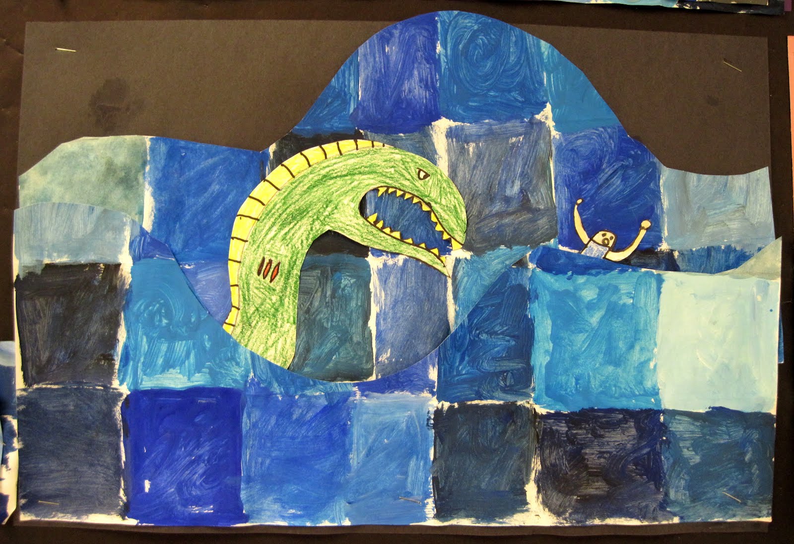
What can be better for 3rd graders than stories of giant birds, sea monsters, and whales that look like islands? Why, the chance to paint, to mix colors, and to interpret the stories their own way, of course! (Note the sheep in the mouth of the giant bird above!)

We began by looking at Paul Klee's painting Sinbad the Sailor, pictured here:

We noted the values of blue in the water. Students folded up papers to make many rectangles, and were given various blue paints, along with white and black. They merrily mixed away, creating as many different blues as they could. NO BRUSH WASHING NECESSARY! If their brush had too much paint, they wiped the excess on a paper towel.

This photo below showed what happened when one brand of white was dipped into a thinner brand of blue. The kids were very excited by this and even more so when I took a photo of the magic in the paint dish.

My original plan for this lesson had a step of creating a second paper using orange, black, white, and blue to create a variety of browns to mimic the sky of Klee's painting. I changed the plan when I realized that it would take too much time that we didn't have.

We looked at a book with the stories of the 7 voyages of Sinbad. I didn't share them all. (For example, I left out the island filled with cannibals, and another island where an old man forced Sinbad to carry him around on his back for days. Just too weird.) We focused on these tales:
  • the story of a beautiful island that seemed to be having an earthquake but turned out to be a whale with beautiful foliage growing on its back;
  • the tale of seeing a a glowing orb in the distance that turned out to be the egg of a huge bird called a rookh, which was overlooking a valley filled with diamonds and snakes - Sinbad tied a rope to the rookh's leg and was hoisted into the valley when the rookh went down to feed, and came back with a heap of diamonds in his pockets;
  • the story of the island of the apes, which included an ogre;
  • and of course the tale of a sea monster, which we decided was depicted in Klee's painting.
Students drew and colored parts of their story on 9"x12" paper - some kids used more than one piece of paper if they had lots to depict - and then cut them out. The blue paper was cut across to create a wave or many waves, and the students used both pieces to create water. A construction paper sky was chosen, and then the parts were all glued together.

The whale was a popular story to draw:

But so were sea monsters and ogres,

and of course the rookh and the giant egg.

I think they are each imaginative and terrific; don't you?

Here's one of the two bulletin boards where these paintings are currently on display.

Saturday, August 27, 2011

Indigo?

I love color. I'd actually do to do this to my hair in a heartbeat, if I had enough length and knew how to get these brilliant colors (I mean, my white hair will take dye quite well, I'd think). And I love teaching color. But I want your thoughts on something.

I've noticed a lot of people on Pinterest who are pinning a video (here's the link: Roy G Biv) by the musical group They Might be Giants to use in their classrooms.

Truth is, I have trouble with the whole Roy G. Biv acronym. As I said, I love teaching color; it's probably my favorite thing as an art teacher. But hey, my color wheel doesn't have indigo on it. I don't have a bottle of paint that says "indigo" on the label. What the heck is indigo, anyhow?!
(this image is from the video)
In the video, the color pointed out as indigo (the second stripe from the bottom) looks like violet to me, and then the color they call violet (the bottom) looks like a blue-violet, actually almost ultramarine. (An aside here: there used to be a color of tempera paint in the Sax Versatemp line called "ultra blue" which was this type of blue, and mixed with magenta it made the most spectacular purples, but sadly it doesn't seem to exist any more.)

Anyhow, I tend to teach a traditional red/yellow/blue color theory, but then I tell the kids that there are different KINDS of reds and blues and you get such different results. I'll put out trays with red, yellow, blue, AND magenta (for a "substitute" red) and turquoise ("substitute" blue). I used to add the ultra blue as well. And then we mix away.

The kids discover they can make different violets and oranges if they substitute the magenta for the red, and they discover that if they mix them (red and magenta) together, they get a wonderful cherry color. We note that the turquoise makes a great green but a terrible purple, and then we discuss why (yellow in the turquoise). With ultra blue we used to discover a whole different range of violets. I show the kids that if they mix compliments, or all three primaries, or else just a random bunch of colors together, they might get all sorts of browns and grays. And we mix black and white and look at how much different the gray is from the one that we can get by mixing, for example, blue and orange.

So, cute as it is, no Roy G. Biv video for me. What are your thoughts on this?

Friday, April 15, 2011

How many colors do you see?

How many colors do you see?
You may think there's 4 (or more), but there's only 3!

This lesson making a color optical illusion came out April 2003 School Arts magazine.

It's really easy to do. Three colors are chosen, two "dark" and one "light". The dark colors are labeled "A" and "B", and the light color is "C".

A simple shape, no bigger than a quarter, is cut out of the A paper and glued (use a good glue-stick) on the B paper. The B paper is then cut in the same shape, larger by 1/8", then back to the A. The entire color pattern is:
A-B-A-B-A-B-C,
B-A-B-A-B-A-C,
A-B-A-B-A-B-C,
B-A... until you run out of paper.

The big thing to be careful about is not to skip all over your paper gluing and cutting. You will run out of paper. Start at a corner, and try to snug it in nice and close each time you glue it down to cut again.


By the way - I have the kids LABEL their papers, and write the pattern on the C paper, crossing off each time they cut out a new layer.

It may be hard to see the illusion on the blog post, but trust me, if you hang these up and stand back a few feet, it works! When I started the lesson, I held up some samples and had kids raise their hands and ID colors they saw in them. They would list as many as 6 or 7 colors, most of which were not actually there at all. Your eyes do color mixing based on the colors that are placed next to each other. It's a good color lesson!

Wednesday, November 3, 2010

4th grade still life paintings a la Matisse


Yes, the 4th grade paintings are FINALLY getting done! I've previously posted how we drew from a still life setup, using viewfinders, squinting like pirates.
Then we began to paint. The paintings are big - 18"x24" paper with an interior frame to make them easier to handle (in other words, a border of about an inch was kept white). Students were instructed to paint big areas first, including negative space, and then the patterns would be added later.
Students were responsible for mixing their own colors. I set out a tray of some basics: red, yellow, blue, and white (of course), and I also included in the tray some bottled green and orange just for more choices. Each color had a pop stick in it. Each student got his own little "palette" (actually a microwave dinner dish). We talked about the color wheel, and that we didn't want to mix mud puddle or swamp water, as they weren't "Matisse-like" colors. We reviewed how colors close to each other on the color were good mixes, and why you might use a color across the wheel. For example, the green wasn't used "straight" - they might change it by mixing with yellow, or blue, or white, or maybe with a dab of red for an olive or darker green, since there was NO BLACK.
The students were finally allowed to use black for outlining if they wanted, when all other painting was done. Most did, and some didn't.
I explained that the still life offered a starting point for colors and patterns, but that they were free to make their own decisions as to what worked best for their art. They got so into color mixing that I thought these paintings would NEVER be done. I did offer some "premixed" colors to a few students who were stuggling to make progress.
Some paintings are decidedly more abstract than others.

As for cleanup: with lots of dirty brushes, and lots of dirty palettes, how do we do it? At the beginning of each class, certain students were designated as brush washers and palette washers. The other kids all put paintings in the drying rack, washed tables, dumped water bowls, covered paints, etc. Of course some days went better than others!