Saturday, February 28, 2015

'Fractured Faces' - the Picasso Slip 'n Slide!

I was searching through some folders a couple of days ago, and I unexpectedly uncovered the artwork which you see on for this post.  I have been blogging for about 5 years, but I've been retired for 3 of those 5 years, and I taught for 34 years before I ever even started blogging!  So that means I have 34 years of art projects and lessons that I have never shared.  So now and then, I'd like to tell you about some of them.
These lessons were completed before I started regularly photographing student work (in the days before the ease of digital photography), so most of what I have to share with you are my personal project samples, and not student work.  The images in this post are from lessons when the students were learning about Pablo Picasso.  The students were looking at his cubist portraits.  They noticed that the models often appeared like they were looking in fractured mirrors.  And the models were often viewed from multiple angles at the same time, with front views and profiles in the same image.  And the images were frequently bright and colorful and unexpected, and had a wit and humor about them.  So out of these revelations about Picasso's work, came this lesson, Picasso Portrait Slip 'n Slides, or alternatively called Fractured Faces
To start, students drew a goofy portrait, (as shown in the image above) which could, if desired, include elements of profile and front view, with exaggerated features.  Then, using a ruler, the image was divided up by several lines.

The students then colored the face using markers, and cut the image along the  ruler lines.  Students were given slightly larger pieces of paper, and the portrait was arranged on the paper like a puzzle.  Then, before gluing, the puzzle pieces were slid in one direction or another and slightly rearranged, while still retaining enough visible elements of the face.  When the students were satisfied with their compositions, they were given the go-ahead to glue them down.
Finally, the negative space in the original image, and the new negative space that had been created when the image was moved about, were all colored as well.  The image above is a sample of student work for this project that I discovered with my samples. 

Sometimes the images were filled with colorful patterns and designs, as in the images above, and sometimes the shapes were filled with areas of solid color, as in my sample pictured below. 
You may be surprised to see me posting a lesson that uses just marker, because usually I like to have my students work with materials that they are not likely to have at home.  But sometimes, it just works.  And sometimes, if many of my other classes were working with messy materials, I would have one grade level work with something non-messy to give me time to prep and clean.  So for this project, the bold colors of markers worked great.  But you could certainly vary this lesson in many ways.

For example, see the still life below, my sample.  For this project, I looked at and drew a still life arrangement of various bottles.  The drawings were 'fractured' with ruler lines before coloring.  The drawings were then colored with oil pastels, using rich patterns.  Though this wasn't cut apart as with the portraits above, it certainly could be. 
In another variation (sadly I couldn't find a sample), students drew a simple fractured image on a small piece of paper, tracing the lines thickly with a black marker.  Then, a piece of clear acetate was taped over the drawing, and the spaces between the lines were colored thickly with oil pastels.  The lines were left uncolored.  When complete, the acetate was flipped over onto a piece of black construction paper, which showed through the clear areas of the acetate re-creating the black lines.  The results are really cool!!

Today I read a conversation on on the Facebook Art Teacher page, about whether to show students teacher examples of final products, or not.  There were concerns about students copying if they saw your completed sample.  However, I feel strongly that students need to see a finished example, so that they have an understanding of where they are going.  Certainly, once it is shown, it doesn't need to be left out where it could potentially be copied.  But I think that kids need to see something completed, to understand the level of craftsmanship you expect, and to help guide them with choices they make along the way. Just my opinion, I know.

Before I end this post, I need to give a shout-out to the wonderful Patty over at Deep Space Sparkle, who recently posted a cubism project available for purchase in her online shop. It was ironic that I unexpectedly uncovered these pieces a day after she had posted about her project, and I'm exceptionally appreciative that she gave me the go-ahead for this post despite the timing.  Thank you, Patty, you rock! 

Thursday, February 26, 2015

We all have to start somewhere! - 'The Bridal Party'

Today, while searching for something else, I came across the pictures in this post.  They are  pre-digital; they were taken during the 1985-86 school year, my first year in the district where I spent the next 27 years.  I had already taught high school in another district for 8 years, and when my job was cut, I spent one year teaching K-12.  In 1985 I began teaching K-8 in the district where I finally I retired 3 years ago.  These photos are from the first year of that job.
 In this new position, I had nobody to consult with; I was on my own.  I had no experience teaching elementary (other than my student teaching experience 9 years prior), and there was very little left behind by the previous art teacher.  I believe I was hired because the high school art teacher (who worked in another building, in another town) saw my name on the application and recommended me.  He had been a good friend in college; I appreciated his trust in me.
 
I taught K-4 in a miniature ramshackle makeshift classroom (a tiny former basement locker room) in a teeny school in a rural village, that served as my art room in the morning and a music room in the afternoon, so there was a piano, and other musical equipment in the crowded space.  (The superintendent didn't even want to show me the room before I accepted the job, because he was afraid I'd change my mind.)  Luckily, there was a sink, and a couple of cabinets for my materials.  They custodian put casters on the table legs so that the music teacher could move the tables aside for her movement activities.  Every morning, I would move them back. In the afternoons I drove to another building in another small town to teach grades 5-8, where over the next 13 years I went from having no room at all, to a variety of shared situations.  It all changed finally when my school district consolidated into one K-12 building and I got my very own K-6 classroom, where I worked until my retirement.
Anyhow, I knew elementary art teachers did papier-mache.  I had zero experience, (I had never even done papier-mache in art class as a kid) but nevertheless dove in.  My young niece told me she had just made a papier-mache lady using a bottle as an armature in her 3rd grade class, so I decided it was a good way for me to begin.  We collected bottles and stored the work-in-progress on a fire-escape staircase inside my room, and on top of the old-fashioned radiators, and anywhere else I could stuff them.  I strung an illegal clothesline across the room for wet paintings, since there was no drying rack.  I distributed materials from the piano bench and top of the piano. The music teacher and I passed like ships in the night, alternating schools daily, but luckily somehow became good friends despite her annoyance at my wet art projects dripping everywhere.
I found a bag of wheat paste in the room so that's what I used that first year.  The projects we created were rough and crude, but the students thought they were wonderful.  Several students decided that they should work together and make their projects into a bride, groom, and bridal party.  The images in this post were from the work of that little group of students.  The next year I found an article in School Arts about making kachina dolls out of bottles and detergent caps (for the heads) and with some experience under my belt using a bottle armature, they were pretty successful.  I'll share the photos of them another time, but in the meantime here's one that I made.
Over the coming years I was able to hone my skills and by the time I retired, I was often teaching workshops in the use of papier-mache at my state conference, and it had become my favorite material. 
So if you are doing something you've never done before, and the results are maybe not quite what you hoped for, remember two things:
  1. You are not damaging the kids by starting from scratch and learning with them, and turning out work that is less than perfect, as long as you approach it with enthusiasm and a positive spirit.  They will enjoy and appreciate the experience, and be proud of what they have created.  We all have to start somewhere!
  2. It will get better, and your successes will grow over the years.  Don't be afraid to dive in, and let the adventure begin!

Monday, February 16, 2015

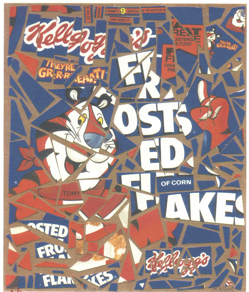
Cerealism for Pi Day

Earlier today, I learned that the annual Pi Day is coming next month (on March 14th, to be precise).  And that observation reminded me about a really fun American (NY) pop artist, Michael Albert.  I first discovered Albert and his work about four years ago, and blogged about him at that time, here.  But it's been a long break, and I thought Michael Albert deserved another mention.
The 'Pi' collage above is one of Albert's iconic works, reproduced in posters and jigsaw puzzles and more.  What a terrific merging of math and art!

Back in 2011, when I wrote the original post, my 3rd grade students had learned about pop art, cubism, and surrealism.  So discovering Michael Albert was perfect.  Here was an artist who couldn't bear to throw way a Frosted Flakes box, so what did he do?  He cut it apart and collaged it, of course!   It has the shattered look of cubism, the pop cultural relevance of pop art, and the added bonus of being made from a cereal box.  And so, 'cerealism' was born!
 Albert has made many more collage pieces from cereal boxes, sometimes recreating the cereal box or a well-known quote, sometimes recreating other well-known iconic images, and much more.  Here's a selection of a few more of his pieces:
One more, below, is the Preamble to the Constitution.  I had to memorize this in elementary school.  I don't think kids today are asked to do that sort of memorization.  Social studies and art!
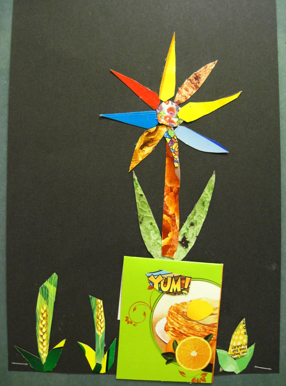
My students were used to saving cereal boxes for the art room, since we used them so frequently, for creating features on papier-mache armatures, for paint scrapers, and much more.  But this time, I cut up the cereal boxes into random size rectangles and spread them out on a central table.  The kids each selected a piece of colored tagboard to glue on (leftover pieces of tag of various dimensions and colors). Armed with glue bottles, scissors, and their imaginations, they went to work, selecting cereal box pieces from the central table.  It was a quick art project, and as a result I have very few photos. The photos posted here of their work can also be seen in the post from 2011 (there's a few more pics there).   
The kids really enjoyed the humor of Albert's work, and also the fun name he had coined for it.  And we all had a good laugh when the older kids saw their work in the hall, and told them they were a bunch of 'cereal killers'!
Each child had his own approach; some kids started by seeking the letters to form words and phrases, and some kids spent time searching for pieces of certain colors.  Their completed work was simple due to time constraints, but it was also unique and fun. 
I loved that Maria chose to make this, below:
 To learn more about Michael Albert, visit his website, here

Thursday, February 12, 2015

Relax; it's just a sheet of paper

A couple of weeks ago, when I wrote a post on fostering independence in the art room,  I said I was going to write a post about the things that go wrong. And now that I've set out to write it, I realize I don't have the visuals I'd like, but I'll do the best I can.  
In that prior post, I wrote this:
"My point is this: we should offer students the opportunity to become independent thinkers.  We need to let them gain a level of independence to make them confident about their work, and less dependent on copying or tracing that of someone else.  We need to prevent ourselves from being helicopter art teachers, hovering over our students and making all their decisions for them.  Sometimes, yes, they will fail.  And that, broadly, is the topic of my next post."

I never got to that 'next' post until now...
So - the things that go wrong... We've all had the student who, the minute you turn your back, is pitching his (lovely) work in the trash and sneaking a new piece of paper.  (Can you tell, I have a very specific student in mind right now?)  It's frustrating, and to be honest, I'm kind of a nut about unnecessarily wasting paper, and frequently the kid who wants to repeatedly start over already has got something good going on.

Instead, I believe we should get our students to 'embrace the mistake'.  Sometimes that's easy. For example, when the 6th grade cartouche carved into Sheetrock cracked, the student glued it back together and decided the visible cracks made the work look more 'ancient'.  And everyone started breaking their projects on purpose to make theirs look old too.
Or when a bit of the color in this 'toothpaste batik' washed out more than expected, the 5th grade artist happily used a Sharpie to add in some lines and colors that were not there in the first place.
But not all young artists are so easily convinced.  I've told this story before (here), but I'll tell it again because it relates to my point here.  Years ago, my 3rd graders embarked on a Monet project that I had seen presented in a workshop at a conference.  I hadn't tested it out myself (big mistake, friends!).   Finger-paint paper had been used in the demo (I still don't really know why).  Tape was used to mask out a Japanese bridge, or an arbor, or a fence with a gate.  Watercolors washes of blue were painted on the sky and in the water, and a wash of green was used on the ground.  Then, sponges and/or Q-tip swabs were used to paint in a glorious array of 'impressionist' flowers, using a variety of reds, and yellows, and pinks, and the edges of cardboard scraps were dipped in green paints and stamped to create grasses and stems.  Finally, the tape was pulled off, to reveal the white fence/bridge/arbor/gate, and a few more flowers, stems, and grasses were added.  My students worked enthusiastically, and their projects should have been, and almost were, beautiful.  But my tape was 'better' than the  tape used in the demo, and the tape tore holes in almost every paper as it was removed.  It had stuck too good!  Kids started to freak out.  I quickly grabbed the box of construction  paper scraps and painted paper scraps, and told the kids to cut/tear flowers and leaves and glue them over the holes.  The artwork took on a real liveliness at this point, way beyond my original intent.  I wish I took pictures, but I didn't).  But I discovered one girl sobbing uncontrollably.  At that moment she believed that her work was beyond repair and the world was nearing its end.  It took a long time to convince her that, hey, it was just a sheet of paper.  I had to promise: the earth would NOT stop spinning just because of a hole in a sheet of paper.  The girl's life was not ruined forever because of a hole in the paper.  Find a solution, and move on.

When my students begin a tooling foil project, I always warn up-front: if you are properly tooling the foil to get the deep relief we are seeking, by the time you are done with this project, every one of you will have poked at least one unintended hole in the foil.  It is not a problem.  It's just a hole, and nobody will see it.  (Can you find the holes in these 6th grade tooling foil African-inspired masks?  Of course not!) 
When a tail breaks off a papier-mache animal, and the hot glue repair is obvious and unattractive, I might suggest to the student to embrace the mistake and put a Band-aid on it (an actual, real Band-aid).  And then I suggest, when someone asks about it, to make up a good story about how the animal got injured!
 Sometimes it is a lesson we need to learn for ourselves.  When I finished building Lucy, the dragon on this blog, I didn't have a plan how to attach her wings, so I went to someone for help.  The wings had to be removable so Lucy could fit in my car to be transported.  She is large.  He (the very creative 'shop' or technology teacher) took Lucy, and came back with her later that day, with wings attached, upside down and backwards. They were intended to curve forward and down, to protect her baby (not in the photo).  Lucy and child were on their way to an art show that afternoon, and I had no choice but to embrace the mistake, and learn from it. 
In a college painting class, we were painting in oils on pieces of brown Kraft paper 5' tall x 36" wide.  Our subject was a live model.  It was intimidating trying to get it 'right' with no pre-drawing, and halfway through the class, the model switched her pose and Professor Minewski had us flip our papers vertically and continue working.  After the initial shock wore off, it was a really good experience (and my roommate and I ended up hanging those large paintings in the living area in our dorm suite).  And another professor assigned us to create paintings based on the work of a chosen artist (mine was based on Hans Hofman) and then unexpectedly had us tear holes in them a la Rauschenberg, and totally revamp our original intent.  Both of these lessons were good reminders to me that a sheet of paper, a hunk of canvas, and lump of clay... none of it is precious.  If it doesn't look like what its supposed to be, look at it differently; perhaps it might be some thing else completely.  Don't be afraid to squash the clay and start over.

When something doesn't turn out as planned, but turns into something infinitely more interesting, I have often told kids that a good response is "I meant it to be like that".   But if, as happens sometimes, that the student tries something original and it just doesn't work, is it a failure?  Or is it a discovery? Maybe a sheet of paper has been 'wasted', but is it wasted if the student learned something by the failure?  What has really been wasted?  It's just a piece of paper, and a little bit of time.  It's not the end of the world.  Here's a new piece of paper; try something else.  I've often had this conversation with a student whose project just didn't go as planned:  "Did you try your best?" (yes) "Did you enjoy the activity?" (yes) "Did you learn about or how to do something new?" (yes)  "Then what was wasted? It's just a sheet of paper."  (smile)

And with your students, please think twice before giving them patterns or tracers because you think their work will look 'better'.  Let them try on their own, giving them the room and the tools to create something beautiful, and if it doesn't quite go as planned, guide them to find what their work might become instead.  Use this wonderful book as inspiration:
Children's artwork, created by children, is infinitely more interesting than artwork that is a coloring book activity.  I'd rather see a display of 20 unique and somewhat lumpy looking horses, or cows, or whales, or houses, or whatever it is, than 20 of the exact same shape with only the insides filled in differently.  And aren't you more proud of something you've created yourself? 
Maybe there really are no failures when someone has made an attempt, because even that failure becomes a worthwhile learning experience. 

Friday, February 6, 2015

The Toothpaste Batik Shirt

So if you've read this blog for a while, you've probably seen a post or two or three about the fabulous (and easy and terrific-smelling) technique I call 'toothpaste batik'.  After using the process with students, I discovered I enjoyed the technique so much, I've been using it myself.
I had this white shirt (above) that I bought a few years back, on a sale rack.  I loved the idea of a nice white top, and I liked its shape, but I barely ever wore it.   It was just SO white.  The cuffs got dirty the minute I used a pencil for anything, and I was always leaning against something painty or dirty.  I couldn't keep it clean, so it was not practical at all.  And if I put it on with a pair of black pants, I felt like I looked like a waiter or or  hostess or something, with the black slacks and crisp white blouse with a pin-tuck bib area.  So it hung in my closet almost completely unworn.  Until a couple of weeks ago, when I had an inspiration.  Here's a pic of me in the shirt, maybe 4 years ago. 

I washed it out to remove any fabric softener, and then stuffed the insides with cardboard.  I mixed up a batch of toothpaste resist, which is basically a 50/50 mix of a white toothpaste and an aloe vera lotion, in a squeeze bottle.  Actually, I presume any creamy lotion would work just fine with the toothpaste.  I do not measure for accuracy; hey, when you are using silly materials like toothpaste and hand cream to make art, somehow it doesn't seem to matter exactly what the proportions are!
 Then, I used the resist and drew a bunch of spirals, paisleys, leaves, wavy lines, and all sorts of doodle lines on the front and sleeves of the shirt.  You can see what it looks like with the resist on it, above.  The resist has to dry overnight before painting.  It will feel a little sticky/rubbery when dry. 
 I searched for fabric paints that would be soft, and I found Dye-na-Flow (above) at Jo-Ann Fabrics with a 50% off coupon.  They sold them in a set of basic colors, which are mixable, but I think I'd like to find them sold individually and in bigger bottles.  I ran out of yellow and white and needed to buy another whole set just to have enough yellow to finish the project!  (Good thing I had another coupon!)
These paints are really terrific - they are very fluid, totally mixable, and water-soluble, and vivid.  Above is what my shirt looked like in progress.  It was challenging getting into the gathers and pleats, and all the details of the sleeves. 

When I finished the front, and then the sleeves, I was tired of the whole project, and wanted to use my work table for other things.  So I decided not to do toothpaste on the back, but instead to just jam it full with color.  Here's the finished back.
By the way, when the paints are wet, you can add salt for really cool effects, just like you can with watercolors. I used salt here and there all over the shirt.  Below is a detail of salt effect.
When the back was complete, I let the whole project sit for another day to set.  
Then, I heat-set it with an iron and rinsed out the toothpaste resist.  I finished it with a gentle washing.  And here's what it looks like now.  (You can compare to see how much it faded):
And here's a couple more views of the finished shirt:
 
 If you will be in NOLA for the NAEA convention, perhaps you'll see me wearing it there!
By the way, if you want to see what my students have done with the toothpaste batik process, there are several posts on the blog for you to see.  Either use the labels at the bottom of the blog and click on 'toothpaste batik' or use the search bar on the right, and type in 'toothpaste batik'.  There's lots to find both ways.  And if you are reading the blog on a phone and can't figure out how to do this search, you'll need to click where it says 'view in browser' (on an iPhone it will say 'view in Safari').  Then you will see the complete blog, not just the posts!  If I've confused you, and you have no idea what I'm talking about, come to the elementary blogging carousel on Friday at the NAEA convention, and I'll be explaining it to you then!

A couple more quick points - this is the same process you  may have seen elsewhere using Elmer's blue (washable) glue.  I have tried using the glue as a resist, and found it very difficult to wash out.  I definitely prefer the toothpaste mix.  You may test and discover that some hair gels will also perform similarly as a resist, but they don't flow as nicely out of a squeeze bottle.  The magic of the toothpaste/lotion mix is the ease.  I love authentic batik, but really, this is so much simpler and safer than dealing with melting hot wax, fumes, and then having to iron all the wax out when complete.  For now, I'm a toothpaste batik addict, and I'm thinking about maybe finding a silky scarf for my next project.

Monday, February 2, 2015

Matisse's cutouts and teaching art

 It's no secret to readers of this blog that I am a Matisse fan.  Truthfully, my favorite Matisse works are his portraits and models and room interiors and still life paintings, ablaze with vibrant, intense, and bold colors, especially those with rich patterns and lively compositions, and frequently with my personal fave, red.
But I also love the playfulness and vibrancy of his cutouts, so I made sure to get to NYC to see the exhibit of the cutout work at MoMA.   The sword swallower below is from the book Jazz
I own a copy of Jazz, but the flattened colors of the reproduced images do not properly represent the vibrant painted paper used in the actual cutouts.  I learned that he painted his paper for the cutouts using gouache, and oftentimes in the cutouts you could see subtleties of variation in the values of the colors that are not in evidence in reproduction.  These subtleties make the works so much more interesting to see.
A year ago, on a trip to the Whitney, we spent some time viewing Calder's Circus (above), and I couldn't help when I looked at many of the Jazz circus-inspired images on the wall, thinking how well the two works of art, would partner together in an exhibit, perhaps with the circus in the center of the gallery, and the Jazz work surrounding it on the walls.  They both have the joy and playfulness to perfectly complement each other.  And both of them show a looseness of expression, and are reminders that we shouldn't take ourselves or artwork too seriously.  We should experience joy both in the making and the viewing, I think!  And I love that one is made from random recycled materials, and the other is made from cutout scraps of paper.  A perfect pairing, don't you think?
 My limited photos do not do justice to the cutout show.  This wall, above, was a pop of vibrancy when you walked through the doorway of the gallery.  So lively and colorful!  Again, so joyous! I think this exhibition was absolutely the BEST art exhibit for teaching art.  There were so many lessons to take back to the classroom.  While I apologize that I don't have the appropriate images here to illustrate, the images are easily found on the internet.  These are some good teaching points to remember:
  • Matisse didn't pre-draw all his cutout shapes, though for large scale pieces such as The Swimming Pool or the work he did designing a church, much pre-planning was essential.  So pre-planning really depends on what you are  doing!  Sometimes it's good to give scissors and paper to kids and let them see what happens, without too much direct instruction.
  • When Matisse cut out paper, he frequently made use of the negative space shapes as well as the positive shapes.  In this Matisse-based lesson I did with 1st graders and blogged about 4 years ago here, the students used both the positive and negative shapes in their lively cutout collages.  Just click on any one of the links in this paragraph and you'll see what my 1st graders did in this Matisse lesson.
  • Matisse, with the help of an assistant, did not glue his collages together without moving things around, a lot.  When you look closely at the pieces in the show, you can see all the pinholes, from the pieces being moved around so many times.  (There were even pieces on display that still had pins or tacks in them!).  When I do collages with my students, I often give them a zipper baggie for their pieces, and do not allow them to glue them together until they had been arranged and rearranged several times.  Here's a link to a post with some surreal collages done by my 4th graders, where we used the baggie method of collecting collage materials.  It's important to remind kids that the first answer isn't always the best one.  Moving things around, even pinning them and asking for critique, is a great way to improve your composition and overall design.
  •  Think about all the elements and principles you can talk about when teaching about Matisse's cutouts!  Color, of course, and believe it or not, Value!  Line!  Shape!  Repetition! Rhythm!  Movement!  Balance (symmetrical and asymmetrical)!  Should I go on?  Matisse's cutouts may well be the most 'teachable' artwork I've ever encountered. 
 And for the kid who says "I can't draw", is there anyone who can't cut out some wavy lines and wiggly shapes with a scissors?  Matisse's cutouts do not intimidate kids who are less than confident in their abilities. 
And for the kid who says "this is stupid; what is this for, anyhow?" you can tell them that some of  Matisse's designs, similar in scope to the piece above (garden with parrot and mermaid; mermaid is not visible in this photo), were designed for patios.  He designed stained glass and walls for a church, as well as clothing, and more. Some of his pieces were designs for rugs.  In other words, his designs became part of functional interior/exterior design and clothing design.  And I'd be happy to have any of them on my patio or in my home or worn on my body!

And for anyone with a physical disability that keeps them from doing things one particular way, Matisse is a role model.  When his health prevented him from painting any more, he came up with a new way to create art.  And in the end, he thought it was the purest and best artwork of his career!  What a motivation this could be to anyone who says "I can't!"