I've been married almost 30 years. Which is a hint to when this sample above was made. (Levine in my maiden name.) The fact that the paper is heavily water-stained and the text-heavy project is pre-digital is another clue. Anyhow, the project is one that I did with my students (I think it was either grade 5, 6, or 7), evidently in 1988, as seen below on the bottom of the box, though I got married in February 88, so I am guessing I decided my maiden name was more fun to work with that my married name, Brown. Or maybe I started the project before the wedding. It was (obviously) a package design project. On the right is the top of the box.


Students used careful measurements, parallel lines, and tabs to construct the box templates. The design work was done flat, and the boxes were assembled. For the title lettering, we talked about using guidelines, and some basic tips for readability, such as not mixing caps and lower case within a word (consistency), not using yellow for lettering (unless outlined with black), and keeping all letters in one word the same color, unless there's a good reason to do otherwise. I was much more lenient on the bulk text. Here's the back of the box.
We looked at real package designs for what elements were important to include, talked about some basic design features for impact, and then we had fun being silly, which you'll understand if you take a moment to click on the pics so you can read the text on each side.
Looking at real packages was important for the kids to see what colors are commonly used, what types of lettering, how color was used graphically to make an impact, and so on. If it doesn't grab you right off, you likely will walk right on by.
It's in bad shape, and I'm throwing it out today. I have to edit what I own and after 30 years, this has got to go. It takes up space. Meanwhile....
Also in my discard pile, the gyotaku prints above and below. Now, I know many of you have tried gyotaku, using rubber fish purchased from an art supply store for printing. But oh, not me. These prints are even older than my Levine's Sour Lemonade.
Around 1980, give or take a year, I took a 6-credit graduate Oceanology for Educators class at Project Oceanology in Groton Connecticut. (I wonder if it is still there.) It was, I believe, a three week class, living in college dorms, and spending our days mostly on a retired Navy launch that had been converted into a research vessel, in Long Island Sound and the Thames River Estuary, testing stuff like salinity, using equipment like sling hygrometers (I don't exactly remember what that is, but I like the word), and sometimes putting out a trawl net and seeing what we'd catch. It was a special, unique experience. Everyone else in the class was either a secondary science teacher, or an elementary teacher with a science concentration, and I was a high school art teacher at the time. This enabled me to ask the stupidest questions without embarrassment, and come up with the craziest ideas. Like this.

I had heard of gyotaku (fish printing), so when we got a nice flat flounder in our trawl net, I said "Let's print it!" For some reason I actually had printing ink, a roller, and some printing paper with me. Heaven knows why. Also the markers for added details to the print directly above. Probably Flair pens. But anyhow, the fish was slimy, slippery, and flip-flopping everywhere. We had to sadly 'disable' the fish, to put it nicely, and scrub it down with Dawn to get the slime off so the ink would stick, and then we printed print it. I suppose if we had the internet back then, I could have found out how to do this without harm to the fish. But we laughed for hours, and I've saved these two prints all these years and have never done gyotaku again. Never once as an art lesson. Once was enough. And now that I've told you the story, I don't need the prints any more either. Please don't get on my case about animal cruelty. It was at least 35 years ago.
Another artsy thing happened due to a trawl. We had caught a squid. The boat captain, Walter (a tall man with fabulous rainbow suspenders and had a burly beard), asked me to come quick and grab paper. He sliced open the squid, releasing its ink for me to draw with, using it's backbone as an ink pen. Then he proceeded to eat the tentacles raw. This was WAY before anyone had ever HEARD of sushi!!!! I don't still have the ink drawing, but I still recall the image of him standing tall above me with tentacles dripping from his mouth. I also still have, rolled up in the basement, a large oil painting I did of Walter (not with the tentacles, but definitely with the suspenders) that I can't bring myself to discard. I had a soft spot for Walter and I love the painting.
Back to the studio update, which is what this post was supposed to be about before I found the two projects above. Here's what it looks like today. The futon arrives tomorrow. It will go in the empty space in the pic directly below. It looks like it won't fit, but it will. A bed was there before. The height of the back will JUST make it. I've had to move shelving to accommodate the bed opening out. The rugs will not be piled in the middle of the floor like they are now!
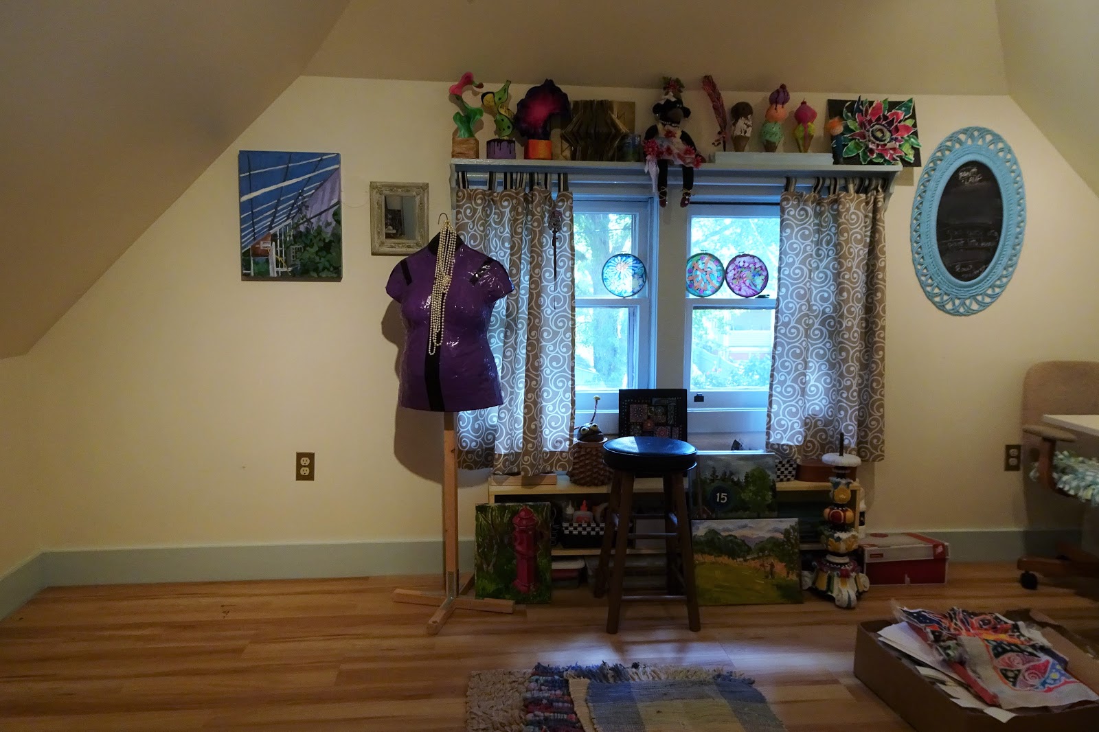
Turn to the right, and here's the window wall, with shelf above and shelving below.
Here's the opposite end of the room. You may not believe this, but I cleaned it up today. The cat likes sleeping on my chair, so the cushion is reversible. The paper cutter will spend its unused time on the floor under the table. There's no other choice. The trash (right-floor) will be emptied tomorrow.
And here's one end of the fourth wall. The folders that are leaning against the red cart will go under the futon, as will the carton of paper and other stuff, topped with toothpaste batiks, on the lower left.
Here's a longer look.
And here's the rest of the 4th wall. The door is temporarily off the hinges to make it easier to bring in the futon. So you are seeing into a walk-through hallway closet. Weird old house. That's a patch of light on the floor, not a sock.
Here's the floor with the stuff that needs to be emptied, moved, and put away.
Tucked at the wall behind my table are some of my sewing stuff on the left, and my French easel and outdoor stool for plein air painting. No other place to put it all.
A closeup of some very stuffed shelving, and Wendell, the bookworm puppet that I made a long time ago. He serves no purpose these days but I like him. I suppose I should find a kid who wants him.
Here he is again.
Below, some of the shelving to the right of the door, including two
Laurel Burch papier-mache cats, and a ice bucket diving helmet. Or maybe it's a cookie jar. My favorite yard sale find.
Also a papier-mache daruma, and a photo of me and my boys a dozen years ago while in Alaska.
Behind my room easel are boxes of large cardboard and tagboard, a giant frame, and other stuff. Every space counts. Behind the cat is a weird candle-holder I made from papier-mache mash.
And finally, the Ugly Lamp. Still a lot of painting to do if I'm ever going to finish it. And then it needs rewiring and a new shade. Here's an
old post link about the lamp.


No comments:
Post a Comment
Due to spam/phishing overload, comments are no longer being accepted on this blog. You can find There's a Dragon in my Art Room on Instagram if you wish to react to this blog or contact me.
Note: Only a member of this blog may post a comment.