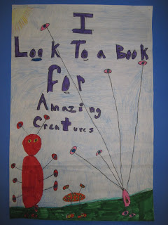


My school district's local library (the Town of Chester Library, located in Chestertown NY) asked me if my students would participate in a poster contest. I'm not a big fan of contests, but I am a big supporter of this library, which loves to give me opportunities to display student work, and they agreed to give a certificate to every participant.
So I thought this contest would present a great opportunity for me to review the rules/guidelines for making a good poster with my students. These are some of the results.


We learned that the average poster is looked at for only 11 seconds, so it is important to grab the viewer's eye immediately. We looked at some posters, and decided that these were the most important guidelines:
- A good poster is simple and clear; it gets to the point.
- A good poster is legible.
- A good poster is attention-grabbing.
To meet these requirements, we learned some important rules for lettering:
- Use pencil guidelines always.
- Don't mix up upper and lower case letters (without a really good reason).
- Don't use a whole bunch of colors in one word. One color is easier to read and more effective. And don't use yellow for lettering unless it is outlined with something dark!
The contest theme was "Look to a Book" We had a lot of fun brainstorming on the white board with all the reasons you might look to a book. The kids thought of everything from relaxation, escape, and adventure, to finding recipes, doing research, learning about new things, and much much more. This project was big challenge and I am so proud of my kiddos!


those are really great! Thanks for linking it to my page. I need to do another poster lesson this year. What is your theme going to be when you do this project again?
ReplyDeleteI don't know what the theme will be yet -still sorting it all out. If I do the lesson at multi-grade levels (probably at 4 and 5) I'd consider using a different theme at each level. We'll see!
ReplyDelete